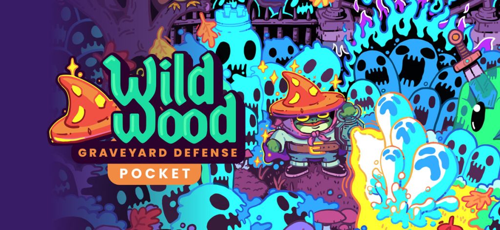
After thinking things through (and then overthinking them) I decided it would be best to rebrand the mobile version of Wildwood on iOS to a “Pocket Edition” or just POCKET for short.
When doing a google search for the game both Steam and the App Store results came up top and on first glance you’d think it was the same game. And that was kind of an issue tbh.
Unfortunately I couldn’t actually rename the iOS app and append “Pocket” to the title because I was already at the max characters allowed. So it’s in the subtitle on the App Store now. Oh well, close enough. You can download it on the App Store here.
To do this I needed to submit a new build of the app as well, so version 4.3 is now live! It includes:
A new splash screen with updated cover art
Upgraded from Unity 2021.X to Unity 6 LTS
Bug fixes all around, and…
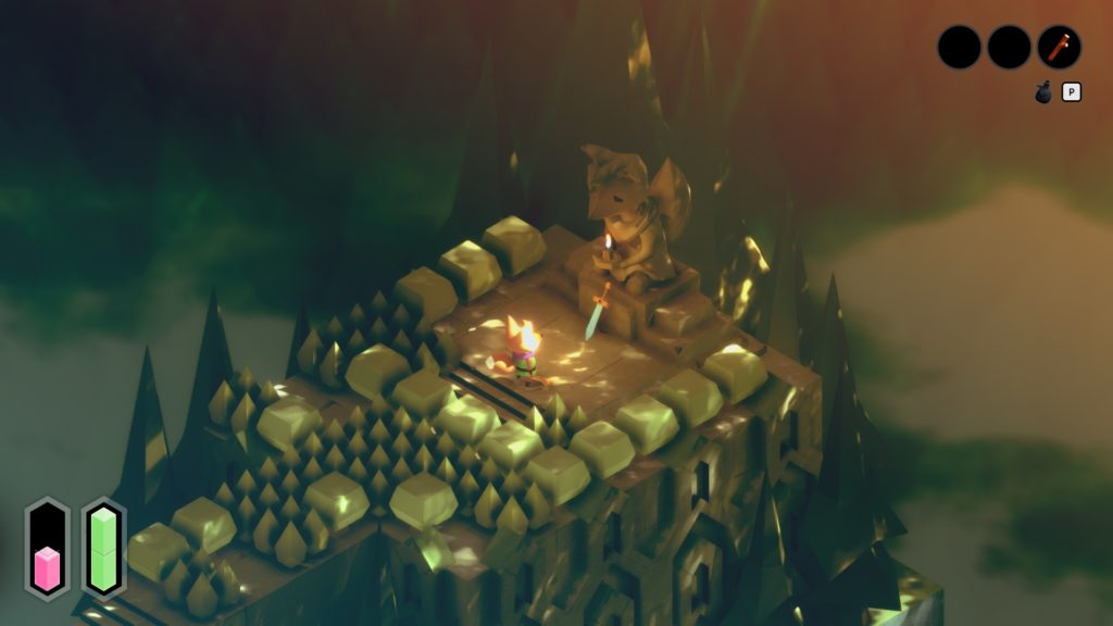
The Haunted Portal is now FREE!!
Buried the lede there huh!? I removed the $0.99 IAP for the Haunted Portal level and decided to just make it free for everyone. As I move away from adding updates to the mobile version and am focusing on the desktop version, I thought that anyone who comes across it in the wild should have a chance to play the Haunted Portal level without having to pay. I also wanted to say thank you to everyone who did purchase it and supported me on my journey. Your contributions have gone straight into development for the desktop version of the game. Thank you!
What else?
Oh, I got featured again right before Halloween on the App Store! Not sure exactly where, but impressions went up a ton. Only a few new downloads though, so no major viral success. I’m not surprised since the game hadn’t been updated in a while, but I’m still very thankful for the opportunity and hello! to any new players out there.
PC Demo is Out Now!
It’s been quite the whirlwind to get here… but the PC demo for Wildwood is officially out! And silly me for thinking that I could have had the entire game wrapped up by Halloween 😭😭😭
Feel free to visit the link above, wishlist and download the demo. I’ve gotten some really nice feedback and I’m proud of how this little game has turned out so far.
I’m planning for a full release in 2026 and have some exciting news to share in the next few months so be on the lookout for that! I’ve also been part of the Scream IV Fest on Steam and have had quite a few downloads from that — more than I expected to be honest. Now is the time to lean more into marketing though and try to be more active on socials. Not my favorite thing but a requirement for the job. Ah well.
I’m tinkering with some updates now for the mobile version of the game. I plan to keep the gameplay the same, but I need to do some bug fixes and deploy a new build. Maybe I can get that done this weekend. Thinking of renaming the game on iOS to “Wildwood: Graveyard Defense (Mobile)” to help with any confusion since it shares its name with the desktop version. Still pondering that one a bit.
Salmon Cohesion Factor
Making Toon Grass Look Good
Many years ago (~2010), I wrote a blog post about “Salmon Cohesion Factor” — a term I made up to describe what I would later find out was actually compositing. In VFX terms, compositing is when you make something blend in and feel like a real part of a digital image.
Fast-forward to today, and I still think about SCF and how it applies to making assets for games.
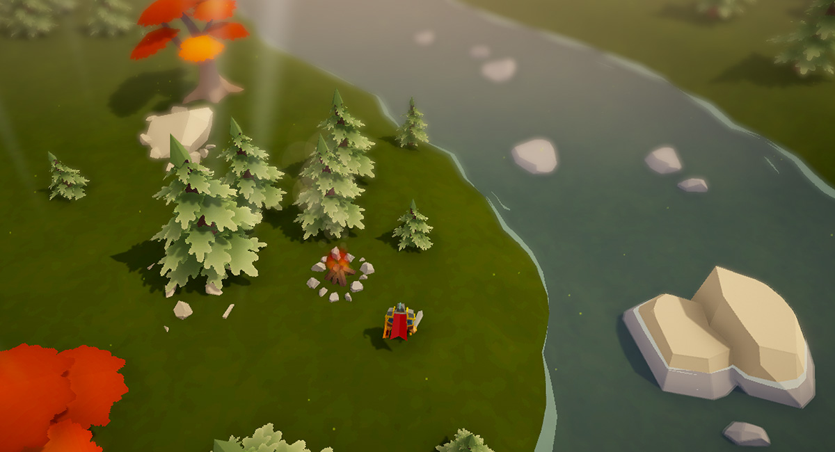
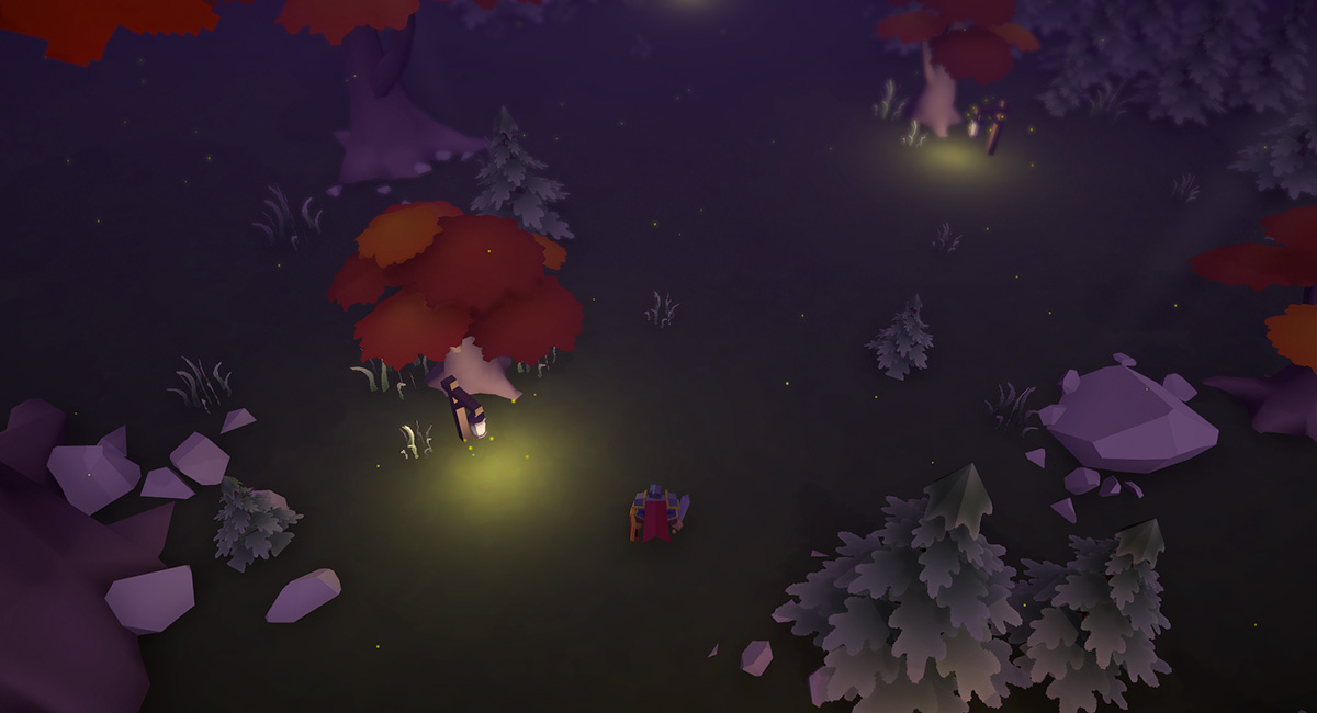
I’ve been working on foliage for Wildwood, and trying to find a style that matches my vision for the game, and also blends nicely into the world. I LOVE me some dense, colorful grasses… but it can’t be too visually noisy.
Here’s my wishlist for foliage:
Blends nicely / isn’t too noisy
Is colorful and charming
Multiple sizes, looks organic
Works with real-time lights
Can be layered and dense when needed
And I think I’m finally landing on something that works… and honestly, just makes me happy to look at!
Click to zoom on these before/after screenshots.
Foliage v3 (2024)
Foliage v4 (2025)
For Foliage v3, I was originally manually placing billboard-based grass clumps and even worked on a custom shader to make the bottoms fade out and add a very rough wind effect. I plopped them on these little “islands” of grass (another manually created mesh) to sell the effect of clumped foliage. After all that, it just kind looked like sand and puddles with some sparse looking sticks. Not great.
Then I spent a long time (maybe too much time) deconstructing some of my favorite games to figure out how their grass/foliage worked.
For Foliage v4, I started from scratch and drew my own textures (both on the ground, and for the grass clumps). I decided to use the Terrain system in Unity to manage everything. Doing so also gave me a much nicer color variant system and better wind shader effect. The result is so, so good and really gives the world a richer feeling without being too distracting to the gameplay.
I’m sure I’ll continue to tweak things, but right now the grass is the best it’s ever looked and I’m super pleased with it.
I’m continuing to work on development and am hoping I can get a demo out soon. Once I can get the base level features nailed down, I can start focusing on adding new mechanics and expanding the content. Q4 will be here before we know it!
🐸🎉
New Wildwood (Mobile) IAP Pricing
Hey everyone!
Short update today: I’ve decided to change the default price of the Haunted Portal IAP in Wildwood to $0.99 (down from $2.99).
Typically this was a sale price during Spooky Season each year, but it will now be the default price for the foreseeable future.
Thanks for your support! 🐸
PS: I tried to make this change a couple weeks ago, but accidentally changed the default price of the game itself to $0.99 (from free) by mistake. Sorry about that! App Store Connect is a little confusing sometimes when it comes to price changes.
The Nearly Perfect Gameplay Loop in Minecraft Dungeons
Minecraft Dungeons was one of those pandemic games that helped keep me and my friends connected. The game immediately sparked my curiosity and I enjoyed playing through the campaign when it launched. The Ancient Hunts mode was an update that came out in early 2021, but it wasn’t until the end of 2021 with the Tower update that I really got hooked and started to see the brilliance of the meta from a game developer’s perspective. Oddly though, it’s one of the few games that I can enjoy playing and not be completely distracted trying to dissect the mechanics!
The integration of the campaign, the tower, and the ancient hunts keeps the game fresh and creates a nearly perfect cycle for player engagement and progression.
For anyone who hasn’t played Dungeons, or hasn’t spent almost 300 hours in it (smiles anxiously), I’m going to detail how each gameplay mode works individually and then show how they all feed into each other and why this loop works so well.
The 3 Core Gameplay Modes: The Campaign, The Tower and Ancient Hunts
The Campaign
The campaign is the starting point for all players. It introduces players to the core mechanics and storyline. The original narrative setup is fine, and it was expanded in later updates to include new realms/themes. The Halloween events and themed loot was also *chef’s kiss*
In addition to learning the core mechanics and finishing the storyline, players also start to collect gear, earn enchantment points, and experiment with different character builds. And that is the central theme to Minecraft Dungeons: the gear lets you can be anything. There are no class restrictions, and what abilities and powers you have are based on what gear you have equipped, and are NOT dictated by some separate skill tree system. Gear is EVERYTHING.
And it’s not only finding gear, but upgrading it as well.
In the main camp area there was an abandoned Nether portal that we KNEW would eventually be opened. Unfortunately, even though the Nether WAS added in a DLC drop, this particular environment prop was never used and remains more of an artifact. It’s really interesting to think that at one time it probably was considered to be the way players would go to the Nether. If anyone from Mojang would like to comment on this, drop me an email haha.
The Tower
The tower is the next step for players. Unlike the campaign, it’s more of a roguelike challenge that forces you to start with no gear at all. With each mini-level completed in a tower run, you are rewarded with a choice of randomized gear. There are usually 30 mini-levels per tower “rotation.”
The tower rewards players by having them think strategically about their gear choices, and introduces you to new builds (ie: gear combinations). For example, in the campaign I typically focused on tanky-style builds that had lots of armor and melee damage. But tower runs introduced me to Souls gear (the equivalent to mana) and I was discovered the power of self-healing, high damage builds that were even more fun to play and min-max.
The tower was also our friend group’s favorite thing to play. Mojang updated tower rotations to be weekly randomized events and we’d play every Saturday/Sunday night when the new tower run dropped. We could complete some towers in a single night, while others took almost the whole week to finish! Those trickier ones we’d replay over and over until we figured out the right mix of gear and builds from the randomized drops that we needed to survive all 30 mini-levels and beat the final boss. We played the tower weekly for nearly a year!
Ancient Hunts
Ancient Hunts are essentially “end-game” content for people who are a little obsessed in fine-tuning their perfect builds.
To do a “hunt”, you have to first sacrifice some gear AND enchantment points earned from the campaign to unlock each run. Depending on the type of gear and the amount of points you sacrifice, you tweak the mini-boss encounters and the probability of finding gilded gear: the ultimate loot.
Regular gear in Minecraft Dungeons usually comes with up to 3 “enchantments” that you can upgrade. For example, a diamond sword may have three sets of enchantments, like: sharpness, life steal and explosive enemy deaths (each that you can upgrade the performance of).
Gilded gear, on the other hand, comes with additional buffs built into the gear itself. For example: a piece of gilded armor may come with 3 powerful enchantments, and an additional Tier III Lightning Damage bonus to any weapons or artifacts that do lightning damage. It’s all about these bonus multipliers!
The Interplay Between the Campaign, Tower and Hunts
The brilliance is not just what each of these game modes offers and how well they each play on their own, but in how they are designed to feed into one another.
The Tower introduces you to new builds and drops rare gear to help do better in Campaign reruns and Ancient Hunts.
The Campaign gives you the gear and enchantments needed to do Ancient Hunts, and can be modified with higher difficulty through Apocalypse modifiers.
Ancient Hunts reward you with ultimate drops so you can further increase the difficulty in Campaign reruns, and earn even higher levels.
And all of this feeds into the primary goal: higher levels, better gear, more builds.
Why This All Works So Well
The interplay of the micro loops inside the macro loop is beautiful and essentially keeps the game moving forward at all times. It encourages variety, reinforces progression, and keeps the campaign relevant.
Each play session also informs the next choice. The systems in Dungeons reminds me a lot of the landmark design in The Legend of Zelda: Breath of the Wild. In BOTW, landmarks are position on the map just so precisely that the player always has a visual on where they can go next while they are exploring. Dungeons is similar with its gear: each play session usually drops some kind of item that sparks an idea of how to do another build that could benefit from that new item. It’s like an infinite breadcrumb trail, where every item you discover sparks new ideas and sets a new goal for your next session.
And I think there’s also parallels to Minecraft proper as well. Both are games that prioritize accommodating different kinds of play styles. Dungeons leans into that sandbox mentality and not only lets players customize the way they want, but also doesn’t lock you in, and allows you to change your mind any time and do something completely different.
Finally, Dungeons seamlessly integrates and expands the lore of Minecraft. Everything fits together really well, and the IP is deep enough that most ARPG elements have some kind of Minecraft-based equivalent. The game balances familiarity with innovation, offering a depth of items and build combinations that can keep players busy for a really long time. I wish Mojang would integrate just some of the combat and item designs from Dungeons into Minecraft. The new Trial Chambers update feels like a first step in that direction. I’d like to believe that they are applying some of the lessons learned from Dungeons into Minecraft.
In the end, Minecraft Dungeons works so well because it elevates player agency, continuously inspires new goals… and creates a gameplay loop that feels as infinite as a Minecraft world itself.
Transitioning Wildwood from Mobile to Desktop
When I first released Wildwood, it was a game designed for phones exclusively. Mobile fit my initial vision for a simple gameplay experience. But over the past few years, the scope of Wildwood has grown alongside my ideas for it. It has become something that needs more space to stretch out. (…and reflects my own growth and need to stretch out)
For anyone not super familiar with Wildwood or game development: this isn’t just a simple port. A platform shift like this is a big decision for any developer because it involves rethinking the entire player experience.
Mobile design is all about simplicity and making the most with that tiny screen. In contrast, desktop allows for adding layers of complexity, richer visuals, better controls, etc etc — things that can be hard to fully realize on mobile. But its not just about more stuff on a bigger screen… it’s about enhancing the gameplay to make Wildwood what it should be.
A few months ago, I reached out to Chris Zukowski, who runs the How to Market a Game website for advice on promoting mobile games. His response was brief but honest: “Too hard.”
His advice punched me in the face in a good way. It was the confirmation I needed to consider alternatives. After years of pushing Wildwood up the Sisyphean hill of mobile game marketing, his suggestion to try desktop felt like a breath of fresh air. After a couple more emails, his final recommendation was to try to find joy in creating games again (and that a small desktop game could help me do that).
But instead of making an entirely new game (which I did consider for a bit), I decided to start with the current version of Wildwood as a base. That also meant changing Wildwood in ways I hadn’t even considered when I first started this project back in 2019. Just some of the initial work has included refactoring the control schemes (and adding gamepad/controller support), and making sure things still feel intuitive.
The biggest realization I’ve had though is that I need to add more new content and make some big changes to the main gameplay loop. And that’s a bit scary. There’s no guarantees. I’m trying to keep things simple though and focusing on finding the fun. Also, I think small games are having a bit of a moment right now and that’s where I’d like to be.
For those who love the mobile version of Wildwood and have been with me since the beginning, don’t worry! I’m not leaving it behind completely. It will continue to be available on the App Store for the foreseeable future.
Ultimately, I’m excited to get deeper into the process and discover what Wildwood can become on a platform that feels better aligned with its spirit. And finally, I want to give a huge shoutout to my friends who got together and gifted me a ROG Ally for my birthday. That was the catalyst that really got things into gear. I’ve been able to play so many more games on it, and it has completely changed my perspective on desktop/gamepad gaming. Thanks guys 🙂
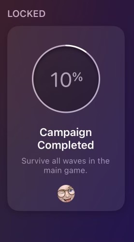
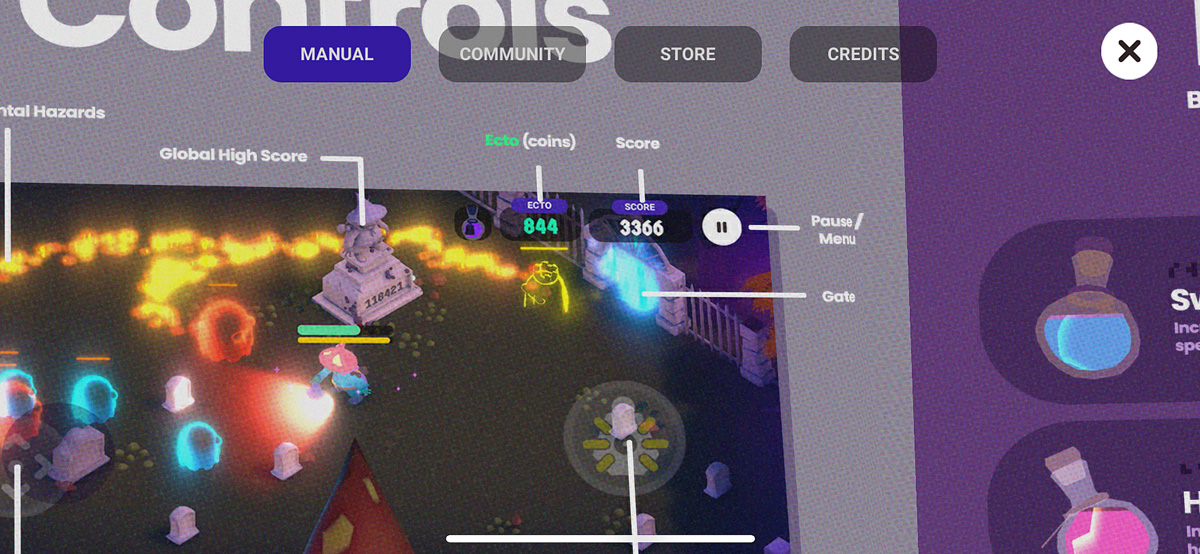
Adding a Progression Indicator to Wildwood
Here’s something obvious that I’ve been missing for nearly 5 years — a way to show the player their progress! Well, I guess technically just one year since I didn’t have waves until last year… but still.
In version 4.2, I added this flag to the inside of the house (reminiscent of the old scoreboard that used to be in the same place). I am now saving the furthest wave you’ve beaten and showing that front and center when you start the game. This also has the added benefit of showing you how many total levels are in the campaign.
Adding this flag has a few benefits:
Shows your best run, and encourages having another try
Shows the total levels, demystifying whether or not the main game is “infinite”
Gives a better sense of progression and completion
Is saved locally and doesn’t require internet or a Game Center account
Is used for earning the Campaign Completion achievement
Serves as a reminder for someone who has taken a break from the game and has come back
For players who do use a Game Center account, doing this also allows me to make the Campaign Completion achievement “progressive” — basically it fills up like by a percentage as you beat levels until you complete the game and earn it. That’s nice to have too!
This was surprisingly easy to implement. Since I am already storing the value of the furthest wave you’ve completed, I turn that into a percentage of 100 (then round it), and send that over using GameKit (using IOS Native, a plugin by Stan’s Assets):
It’s a great plugin and makes interacting with Apple’s GameKit API in Unity very straightforward. I had been using a variety of different methods to do GameKit stuff in previous versions, but have since pulled most of that legacy code out and just using IOS Native to handle all of it.
A Different Process this Year
I might make another post about this soon, and I’ve hinted at it in the past, but I think this year I’m going to do more smaller update to Wildwood instead of doing one giant release in the fall. I’m still planning on doing a more substantial rollout around Halloween, but instead of saving EVERYTHING for that, doing incremental updates has been a much nicer process and way less anxiety for me having so many things to test with the old method.
If you’ve made the jump from Twitter to Threads, give me a follow over there. I’m trying to be more active online and the game dev community I’ve found has been wonderful!
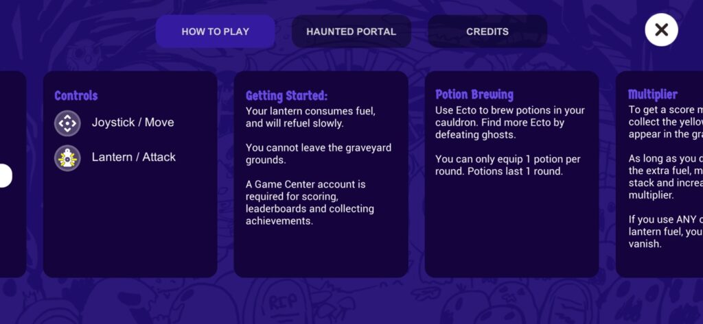
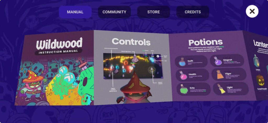
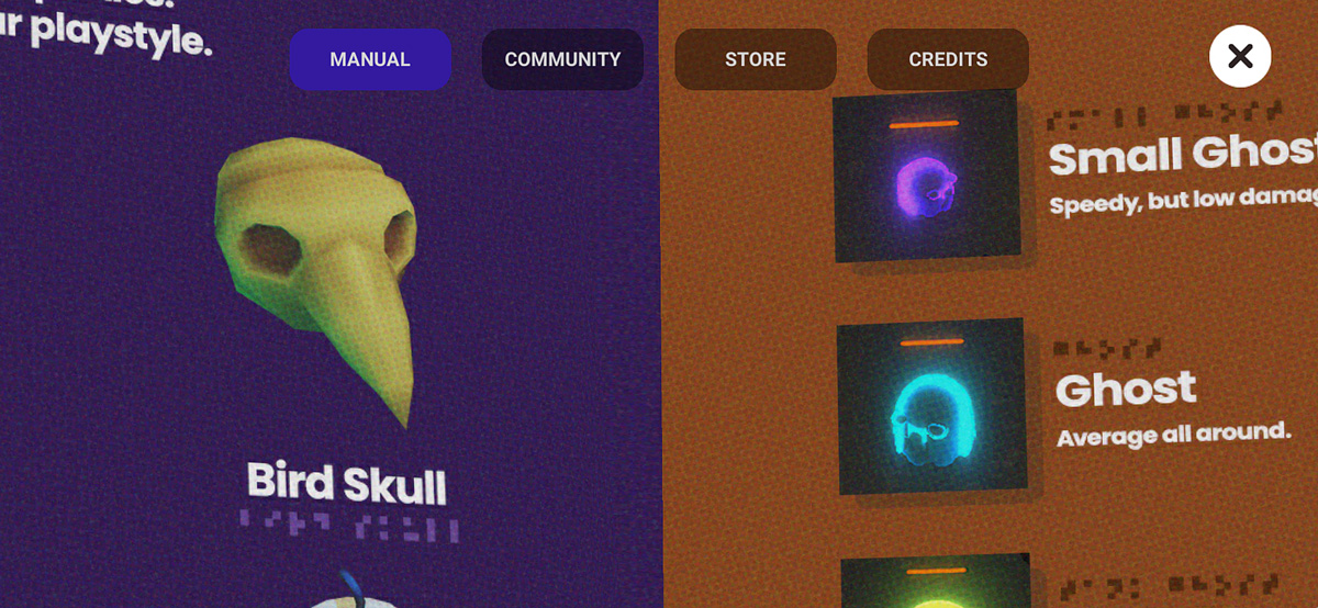
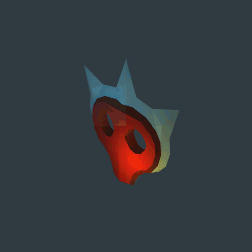
Adding a Retro Video Game Manual to Wildwood
I’m a huge fan of Tunic. Especially the in-game instruction manual.
While not nearly as complex as Andrew Shouldice’s version, I really wanted to have a go at adding my own game instruction manual into Wildwood.
Prior to the update, this was the “How to Play” screen:
The old “How to Play” menu design.
Wow. That’s a literal WALL of text. No one is gonna read that.
So, obviously, an interactive 3D model of a foldable game manual is the only solution to a problem like this! In all seriousness though, the new game manual does actually improve this experience in a few meaningful ways:
Provides visuals for easier understanding
Provides more information
Lends itself to world-building
Is nostalgic, and appreciated by some players
The new retro style Instruction Manual
Here’s a few close up detail shots, and a video. I added some halftone dot patterns to it to give it that printed look & feel when you zoom in close!
As of writing this, the update is currently In Review, but hopefully it gets approved soon and goes live! There’s still some tweaks I’d like to make, but I really just wanted to get it out there. I’m slowly coming around to doing smaller, more frequent updates to Wildwood, versus doing a giant one around Halloween. Last year was just too much for a single update. It’s so much more manageable when you break it down into smaller chunks. Keeps my mental health in check!
I remember Dad bringing home Warcraft 3 — I had begged for it and had thoroughly explained the box art and which flavor I specifically wanted. There were 4 versions, each with their own faction featured on the front. I wanted the Undead one, cause skulls are sweeeet.
Warcraft 3 brought something new to the table. Along with the great level design and strategy components, it had an attention to detail that other games just didn’t. WC3 raised the bar with its in-game cinematics and gorgeously rendered cutscenes. And the personality! The whole game just oozed this amazingly creative and wonderful fantasy charm. The patina has only gotten richer with nostalgia.
Aesthetics & Art Direction
The art direction is impeccable. And those design decisions have shaped my own preference in game design as a result.
Chonky and exaggerated proportions on units was an awesome art style choice that lent itself to unique outlines — perfect for RTS games and understanding what was happening at a glance.
The developers also added 3rd-party creeps into multiplayer maps — a clever feature to gain experience early on in the game, without having to directly confront the enemy player. It also allowed you to secure new resources or unlock merchant shops to purchase upgrades. Furthermore, it encouraged exploration of the entire map. Many multiplayer maps were asymmetrical as a result, and lent themselves to feeling more natural and less like arenas (a là Starcraft II).
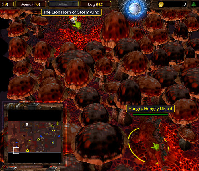
WC3 also had tons of secrets. One of my favorites was the Hungry Hungry Lizard. During the campaign, you play a level inside of a cave. There’s no base building: it’s one of those make-your-way-through-and-survive-until-the-end kind of levels. About halfway through you find a neutral creep chomping away on giant mushrooms that extends past the edge of the screen. If you simply wait (like 10 minutes maybe?) the lizard SLOWLY chomps his way through the forest of shrooms and opens up a secret path to a treasure box. The game does NOTHING to encourage you to wait around. But if you do, you’re rewarded. *chef’s kiss*
Reforged vs Classic
There’s so much to love about this game, and the re-release WC3: Reforged is pretty good too. Although I prefer to play it in classic mode — the updated visuals don’t really do that much for me. In same ways they kind of take away from the immersion. That’s another topic for another day (I’ve found that fidelity and resolution can have a big impact on immersion… or lack thereof.)
WC3 was a defining moment for me and my preferences for art and design. I can see a lot of inspiration from it in my own game Wildwood. I hope one day I can be as half as good as the team that brought WC3 to life nearly 25 years ago.
The Problem with My Freemium Indie Game
Shady freemium monetization strategies exist for a reason—they work. But I don’t like them.
So I decided to experiment with a more traditional upsell path… essentially paid DLC. And since Wildwood gained significant visibility on the App Store last month (2M+ impressions) — it was a perfect storm to test my concept.
Did it work? Here’s what happened.
Adding Monetization to Wildwood
Earlier this year, a kind stranger from the mobile app industry reached out on Reddit and offered advice in response to a YouTube video I posted. One idea they suggested was that instead of selling premium skins (which I was considering at the time), to provide an alternate gameplay mode that would add more value for enthusiasts.
That strategy seemed sensible and honest — so I decided to explore it.
I developed a hardcore, infinite version of the gameplay in Wildwood, and offered it as an in-app purchase (IAP) for $1.99, discounted down from $2.99 through October. This version added unique gameplay elements as well to help keep things fresh, and differentiate it from the main (free) campaign.
In retrospect however, this gameplay mode really just caters to about 1-5% of players — those who’ve completed the game and crave more. Designing the IAP this way significantly narrowed the potential customer base. And considering typical conversion rates in mobile gaming, only a fraction of this small group was likely to purchase.
Results
So, how’d it go? In October, Wildwood got featured on the App Store and received 2M+ impressions, which turned into ~60K page views, and resulted in ~2,300 downloads. From there, 10 people purchased the IAP, netting a cool $19.90.
About a 0.5% conversion rate. Very low.
Analytics and Comparing Against the Trend
Apple provides a “Benchmark” report in App Store Connect — and it’s very revealing. It compares your app against other apps within your genre, and measures performance (Retention, Conversion Rate, Proceeds per Paying User), and ranks each of them across four percentiles (0-25th, 25th-50th, 50th-75th, 75th-100). The report is only available in ‘per week’ slices, so the following data is representative of Oct 9 – Oct 15 (the first full week of being featured).
Wildwood falls in the 0-25th percentile tier (the lowest tier) for Conversion Rate and Proceeds per Paying User:
Conversion Rate: 0.17% (Wildwood)
Proceeds per Paying User: $1.69 (Wildwood)
In contrast, the 75th-100th percentile tier (the highest tier) games average:
Conversion Rate: ~3.06%+
Proceeds per Paying User: ~$22.10+
This disparity highlights the effectiveness of freemium monetization, which often includes premium currency, gacha mechanics, and energy refills, pushing players towards purchases.
Despite a 25th-50th percentile rank tier for Retention (which I’m translating as: “people somewhat enjoy the game and replay it”), sales just did not come through. Either it wasn’t compelling enough, or having the main game be completely free was enough to satisfy most players and that’s all they needed. Or both!
The Twist
To better understand where I missed the mark, I asked for some feedback on the game.
Surprisingly, it seems that some players not only expect but prefer standardized freemium models. Alongside suggestions to watch ads or pay a fee to revive, responses included requests for gacha mechanics, despite the game not featuring multiple characters. To me, this suggested a normalization and maybe even a preference for mobile freemium strategies.
But that’s just not my vision for the game.
I had hoped a straightforward approach could work: Like the game? Purchase more of it.
Yet, my preferences seem to be counterintuitive for mobile gaming. Platforms like Steam or Itch might cater towards a paid strategy better. If I ever ported my game to desktop, I think I could sell it for flat price around $3.
Final Thoughts
My aim in all of this was to cover Apple’s developer fees ($100/year). I might make around $50 this year, if not less.
I love mobile as a platform. The ubiquity of devices out there, and the ever increasing performance is a really exciting thing to be a part of. And I think eventually our only device will be some kind of pocket computer — just plug and play any size screen and input device, and you’re off.
But the reason I got into all this, was because I LOVE the feeling when someone else plays something I’ve created. It’s incredible to know that I was able to give a complete stranger a few moments of joy (hopefully!). That’s why I do this.
Ultimately, Wildwood will probably always be a hobbyist’s experiment. I’m still planning on adding more to the game over the next couple years and continue to use it as a conduit for learning game design and programming. But I think it’s also time to start dreaming about a new game.
Warcraft Rumble UI/UX Inspiration
Warcraft Rumble came out today and I spent a little time during lunch playing the first few levels.
As a long-time Warcraft fan (Warcraft III is my favorite!), I’m always curious to check out a new release. I’ve kept an eye on Rumble for a while and, honestly, I wasn’t super excited about it. The premise is similar to Clash games (spawning units that auto-battle others in an attempt to destroy a boss/tower) but the visuals kind of threw me for a loop.
I like the toon look they went for, and it makes sense within the universe (the lore is that these battles are played on some kind of medieval, analog arcade machine with a dash of magic sprinkled on top). The levels and character models look great!
I was also really looking forward to the classic Blizzard polish — and in terms of UI/UX, Rumble doesn’t disappoint. We’re all used to the slot machine-like nature of mobile games, but Rumble takes it to another level and really dials in the effects. Check out these examples:
Character Unlock
Level Completion: Victory
Level Start
It’s easy to see the care taken to make these look really good, and that level of polish is definitely something I aspire to with my own games.
Like Hearthstone, I feel like Rumble is one of those games created by a smaller team within Blizzard that is really passionate about the product and has room to explore and experiment.
While the main gameplay is similar to Clash, the variety of levels and characters seems to be HUGE. Curious to see how far I get with it 🙂
Wildwood v4.0 is Live!
It’s finally here! The biggest update to Wildwood yet. Here’s the list of new features:
A brand new wave-based level
A reworked survival level
Challenging boss ghosts
Collectable lanterns to upgrade your attacks
Upgraded controller — super responsive movement
Upgraded art, lighting and environments
New gameplay mechanics including: score multipliers, ecto magnets, overcharge bombs and more!
Deeper Game Center integration with new leaderboards
This has been a massive undertaking that I’ve worked on nights and weekends for the better part of this year. Looking back I think the first new code was back in February.
I think Wildwood really feels like a “game” now. I mean, it’s always attempted to be one, but I feel like it finally has all the pieces in it that make it whole. There’s still a lot more I want to add (already thinking about v5.0 for next Halloween!) but the vision and execution are starting to match up.
The update launch this year has been a bit wild, hah, so I’ll be making another post eventually going in to all that. For now, I’m already working on 4.1 to tweak a few things 🙂
I want to give a shoutout to James, Matthew and Zach — they’ve given me a ton of advice and help with Wildwood, and without their code help, insane amounts of testing, and outside perspective, the game wouldn’t be what is today. And of course, Lauren, thank you for the reassurances, your unwavering patience, and all the late nights I spent coding away in the cloffice trying to pull this thing together. Your love and support made it all possible.
Making My First Devlog
This whole process was a lot harder than I thought it would be. Making video content is tricky, but I think I have a much better understanding of it now!
What really surprised me was audio production (and all the tweaks that go into making a voice over sound decent), and just how much footage I’d have to collect to put together. Creators or YouTube, I understand now.
Here it is if you’d like to check it out! Lots of room for improvement 😉
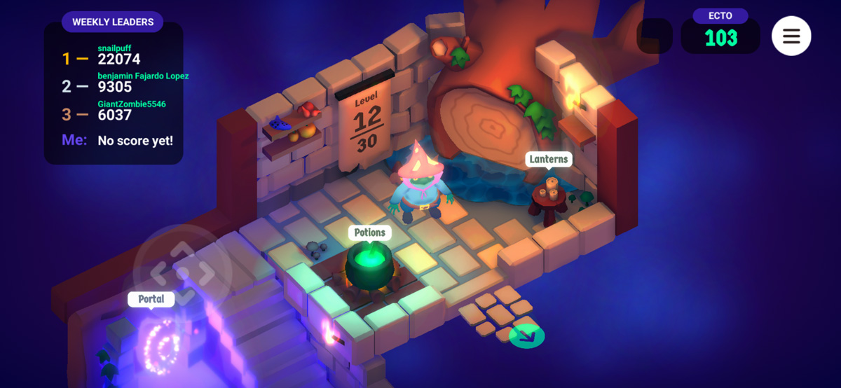
Wildwood v4: Enemy Waves, Refactoring the Potion Store, and… PermaBuffs?
Good news everyone! The next version of Wildwood is starting to shape up.
I’m excited to share some of the new features and improvements I’ve been working on. The primary focus of this update is enhancing the gameplay experience by introducing a new enemy wave system, refactoring the potion store, and… adding permabuffs? More on that last part later.
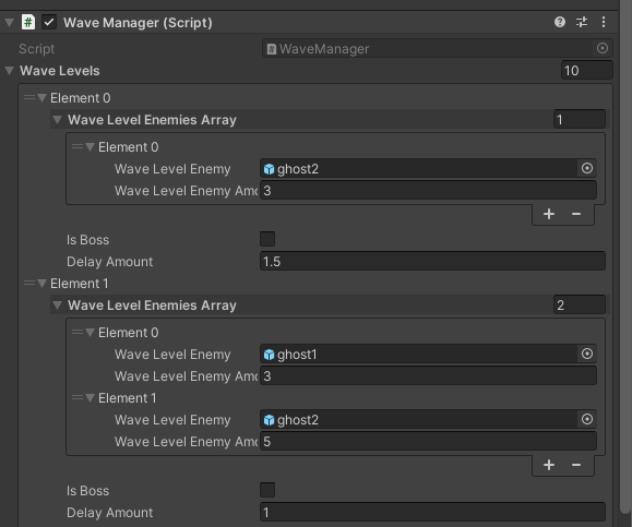
Setting Up the Wave Manager
First up, the new enemy wave system. In the current version, enemies are generated randomly without any set waves, which can be entertaining, but I think there’s room for improvement. I’m working on a system where enemies will come in waves, offering more variety and hopefully, more engaging gameplay.
I’ve got a basic system working for this, and plan to expand on it to get the game feel juuuuust right.
This change should not only challenge players but also encourage them to strategize and adapt to the different enemy types and combinations they’ll face.
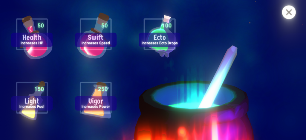
Refactoring the Potion System
Next, James has been helping me refactor the code for the potion store. Together we’ve been working on a new backend system that will make the potion store more manageable and efficient.
This cleans up a ton of the messy code and will pave the way for future updates and additions. It’s amazing what a few organized classes, some arrays and for loops can do!
…Permabuffs?
Finally, I’m considering adding permabuffs to Wildwood. The current idea is that players will spend their Ecto on upgrades for their character that won’t reset each round like how potions do. This new feature should help provide a sense of progression, while also hopefully giving players more agency in developing their playstyle to better suit their preferences.
Balancing this with the current gameplay is really important – I don’t want to make it too hard for new players or too easy for experienced players.
I’m excited about these changes coming to Wildwood and can’t wait to see how they will impact the game experience. As always, I’ll be listening to feedback and making adjustments to keep Wildwood fun at its core. That’s the point, right? 😅
Stay tuned for more updates!
A New Look and Feel for the Website
It’s been 3 years since I slapped together the last design for my website.
I remember thinking “Ah! I just need something basic and flexible and then I’ll work on making it better later.”
And of course, the bandaid ends up being the final design.
The new design is loosely based on some stuff I’ve seen trending on design pages recently and also is inspired from some of the more modular style Flash websites that were so popular around the early 2000s. I’m still debating on doing some kind of splash screen 😅 remember those? Maybe even include some background music! BEGONE WEB STANDARDS!
In all seriousness, this was also an opportunity to build something from scratch using flexbox, which I know is like OLD now, but coming from a place where my day to day is mostly using preexisting frameworks, I haven’t really had to learn the in and outs of it (kudus to CSS Tricks for their awesome walkthrough). There’s no frameworks here, just a couple hundred lines of CSS and the blankslate WordPress theme that includes all the basic PHP functions for a quick start.
I digging the direction so far. It’s a good base and I’d like to dig into animations a little bit more too. Probably nothing too too fancy. Just some good, subtle transition kind of stuff.
Overall, I miss the personality of the web from 20 years ago. (Ouch.) The web has evolved in really great ways, but design has kind of homogenized across the board for better or worse. Design standards can be practical though, and web tech has certainly made development… better?
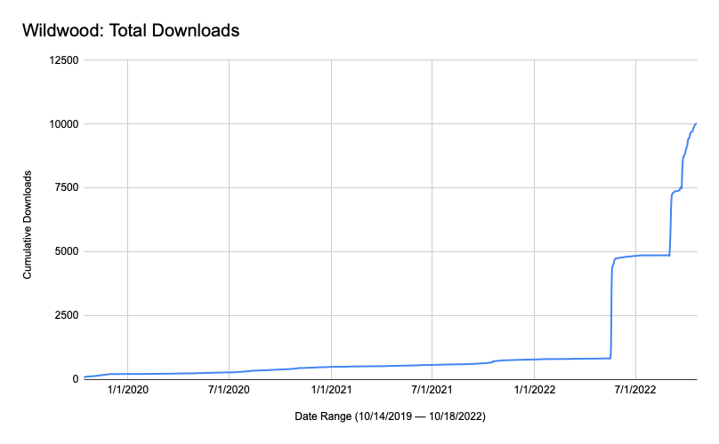
10,000 Downloads
Wildwood officially hit 10,000 downloads on the App Store today. That number is absolutely staggering to me, and honestly I had to Google it to understand what 10,000 humans even looks like. I didn’t expect the result. I never expected any of this really.
Honestly, I’m sitting here with writer’s block trying to describe how I’m feeling inside. I think it’s equal parts disbelief and deep thankfulness. Thank you to my family for their incredible and unwavering love and support these past 3 years, to my friends who were always there to bounce ideas and give me help whenever I needed it, and to all the people that took a chance and played this little game on the App Store. Thank you 🙂
IAPs or Paid?
I’ve been doing some thinking over the past few months on whether or not Wildwood should be a paid app.
Since its release in 2019, the game has been free. This year I experimented making it $0.99 for a few months to see what kind of response I would get. Spoiler alert: it got very little traction. And understandably so. I had recently made some pretty big changes to the app that I thought warranted a paid price (potentially), but the reality is that unless you’re an established developer, or have a completed game with lots of content, it can be hard to break into the paid scene. My game is still very simple and even though I’ve put hundreds of hours into it over the years, I think I’m outside of the realm of paid games.
I would one day like to offset the cost of the Apple Developer Program ($99/year), so I am considering doing some kind of in-app purchase to help me pay for that and keep the game up and running. Right now, I’m toying with the idea of adding premium cosmetics to the game that players could purchase to help support development. I would never do any kind of pay to win thing.
I have a few more years of updates planned outside of all this, and I really love learning game design, programming and all the little things it takes to make something fun to play. Thank you to everyone who’s enjoyed playing it! It means so much to me that I can create something that others can enjoy.
Wildwood: Graveyard Defense – Update 3.0
The big update for Halloween 2022 is here! I’ll skip the formalities and get straight to the good stuff. Here’s the major changes this year:
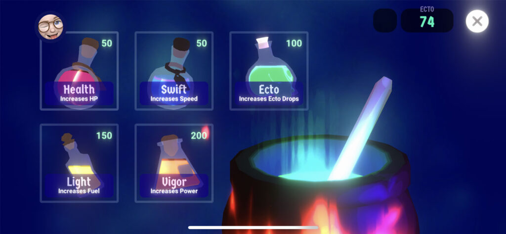
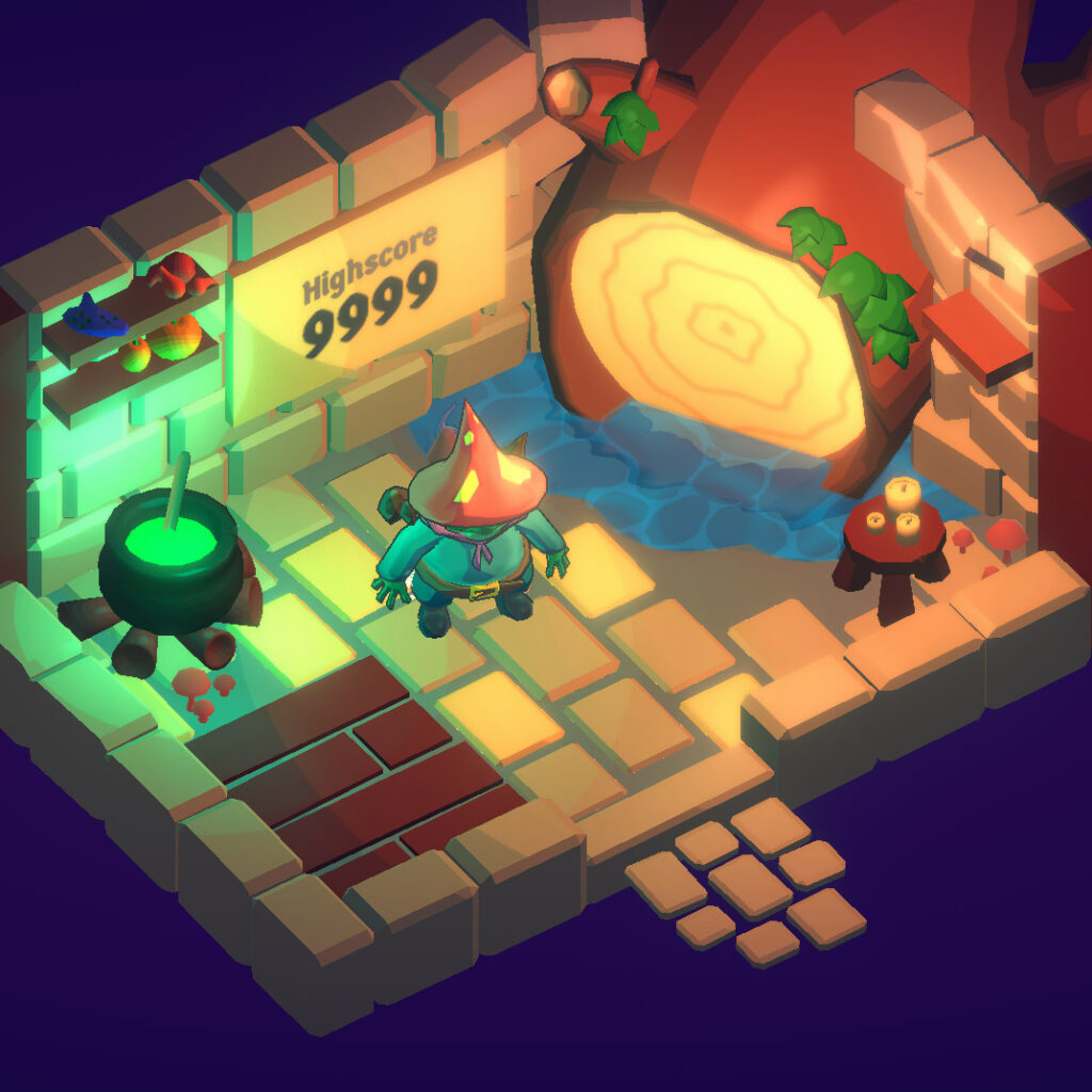
Now that the TL;DR is out of the way, let’s get into the details a bit. This update bounced around in my head for a while, and originally centered around potions. Honestly, the potion system as it currently stands is a V1. Now imagine mixing the effects of multiple potions, buff/debuff balancing… that kind of thing. Really enhancing the gameplay via potions to fit your preferred play style. That’s where I’d like to get it to one day. A big shoutout to MinionsArt for the potion pack – those assets were a huge help to get the new potion system rolling. If you aren’t following already, you should!
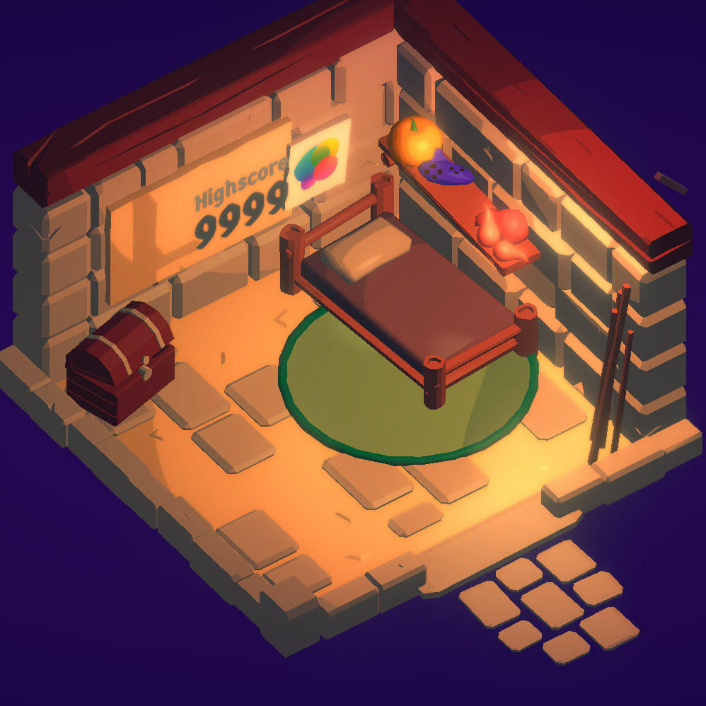
The new potion screen! The Ecto potion is my fav by far.
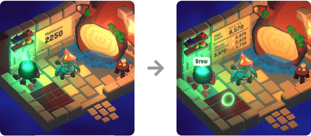
A cool thing happened this summer. I got to talk with some folks at Apple during WWDC and they gave me great feedback on the game and my ideas on where to take it. One item we discussed was strengthening the replay factor. Before V3.0, the main reason for replaying was to beat your own high score, or to drill down inside of some fairly obfuscated Game Center menus to see how you ranked against other players.
They were right – there wasn’t a compelling reason to replay to game more than a few times. So another big change was completely redesigning to “scoreboard” inside the player’s house to surface up more information from your Game Center rankings, as well as creating a new weekly leaderboard that allows a wider group of players the opportunity to rank highly for a while. I’m also considering giving an achievement for ranking 1st, 2nd or 3rd in the weekly leaderboards to further reward players. Some of the people playing this game are GOOD at it. Like… WAY better than I am haha.
Here you can see the difference between scoreboards, and the better context the new version gives the player.
I’m mostly happy with this design, but it’s a little too dense and could be improved. Ultimately I’m going to need some kind of UI window to display this information at a proper scale, but this works for now.
Redesigning the scoreboard also lead to some other improvements – your local high score on your scoreboard used to get cleared out if you deleted the app and reinstalled it. Your high score would still be in Game Center, but not visible in the house (kinda confusing). Now the entire scoreboard is driven by Game Center. This does require a Game Center account to be fully functional, however the old method is used as a fallback if the player opts to not use GC. They just get their local high score displayed at the top of the board instead.
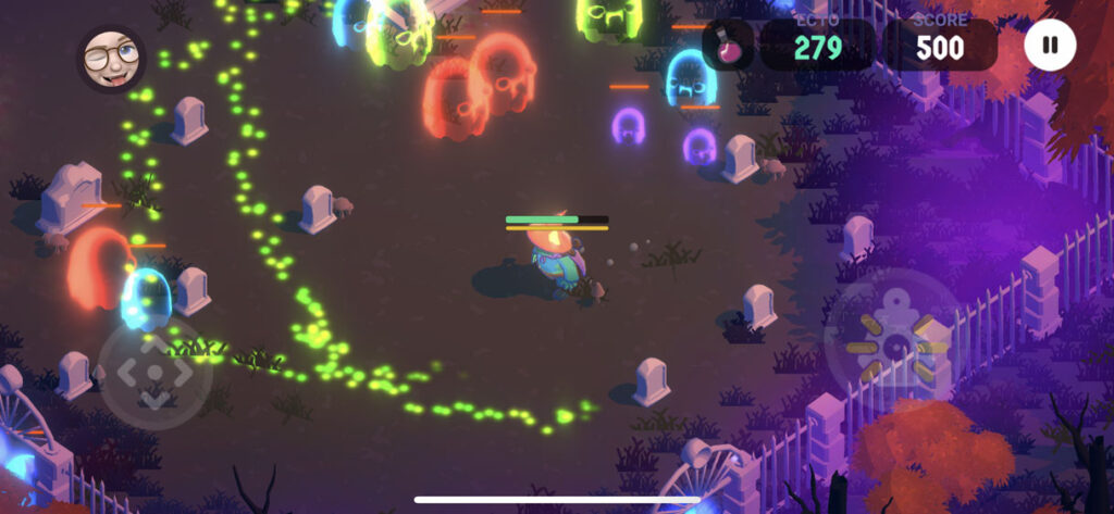
Finally, the last thing I want to touch on is the new ghost type. James and I had been discussing the concept of “chaos elements” in games. Loosely defined, it’s basically a mechanic that isn’t predictable and affects gameplay directly. An example could be the cannons in Fall Guys that shoot out randomly sized/shaped physics objects that you have to avoid – it’s unpredictable. I wanted to incorporate something like that into Wildwood, so the poison ghost was created! Essentially, all ghosts track the player and adjust their paths accordingly. The poison ghost lays a trail of poison behind them that inflicts damage on the player if they cross over it. The trail evaporates over time. This mechanic disrupts any routine paths the player may take in the level, and forces them to rethink where to travel, if they should engage with the ghosts, or if they should take the damage and continue forward. I love the sprinkling of chaos/emergence it adds.
Here you can see the poison trail left from the green ghosts. The preferred path is blocked unless you want to take extra damage.
I hope everyone enjoys this new update and gives the game another go if they can. I’ll be watching those leaderboards — good luck!!
Defining Moments: The Legend of Zelda: Ocarina of Time
It was 1998, and I had just turned 11 years old.
Sidenote: I had to do the math a couple of times on that — the memories made it seem like I was much younger when I first played Ocarina of Time.
My neighbor had gotten a Nintendo 64 for Christmas and with it, one of the most popular games of all time. This was an interesting time, because I still had a novice approach when it came to games. The “idea” of beating a game was still kind of new to me. As a younger kid, we played video games on our NES or GameBoy and just played for fun, without much intent to finish the games or win the levels. I can’t tell you how many hours I spent playing Mario Kart 64 on multiplayer just to build rudimentary strongholds out of fake item pickups and banana peel chains.
But OOT was a little different. There was a sense of identifying with child Link, and a desire to see where this story took him. There were fleeting moments of crushing on Saria, and hoping the two would end up together in some way. And then big ideas like saving Zelda and ridding the world of evil. All of that crystallized in a very core memory kind of way. Walking into the Deku Tree for the first time and having that feeling of awe, and excitement was absolutely incredible. We were “big” enough to have our own adventures now. A coming of age moment in this virtual world, and in mine.
One bit of context: my childhood was wonderful. Very few responsibilities, a knack for getting through school easily enough, some wonderful friends and plenty of freedom to explore my passions and the real world around me. We spent many warm days outside building forts in the woods and exploring the countryside around us. I was a kid that got to be a kid for a long time. Maybe a bit too long… but that’s another story.
OOT absorbed every moment of my life. It was winter time, so we spent countless hours inside playing it at my friend’s house. We dined on movie theater butter popcorn and Dr. Thunder. When we got stuck, we played outside and relived the adventures we had on the screen. One time we poured tall glasses of Lon Lon Milk and I pretended to sell them outside to my friends like a shopkeeper. I scoured my mom’s catering supplies looking for glass bottles we could use that resembled the bottles in the game. I don’t remember finding any.
Chilly January days instantly take me back to those memories. Something about a new year feels brighter outside (compared to the dark days of winter in November and December), and playing outside in the fields and woods just felt so safe and joyful.
What stands out to me is how long OOT felt. We didn’t have the mental model yet to understand how games worked, we just played them for fun. So when we finally collected all the Spiritual Stones and made our way to the Temple of Time, we assumed the game was done. After what felt like months (probably just a couple weeks in reality), we were shocked to find out we had only completed, what, the first quarter of the game? Now we’re an adult? And there’s temples? And sages? WHAT?!
From the fuzzy bits of memories I have left, I feel like we completed the game in the summer of that year. Our ability to traverse these virtual 3D worlds was clumsy at best, but we were determined. We also didn’t have access to any guidebooks or internet walkthroughs at the time, so when we got stuck in a puzzle (*cough* WATER TEMPLE *cough*) we had to set it aside and walk away. Or play other games. Or we went back outside to recreate our virtual adventures again and again.
By the time we finally finished OOT, I was hooked. The world of games had been opened up to me — and I wanted more.
Warcraft III would come out a few years later and further solidify my passion for fantasy worlds and great stories. Meanwhile, games like Super Mario 64 and Bomberman 64 would instill my passion for exploring every nook and cranny of a game to find every secret.
Ocarina of Time defined a moment in my childhood. A time when I was old enough… but not too old. A sweet spot of nostalgia and coming of age. And it would become a huge inspiration to the games I’m building today.
Wildwood: Graveyard Defense – Update 2.2
Good news everyone!
Wildwood is now officially version 2.2! (Download on the App Store) It’s not a huge update on the code side — but we do have a very big change visually… a new icon!
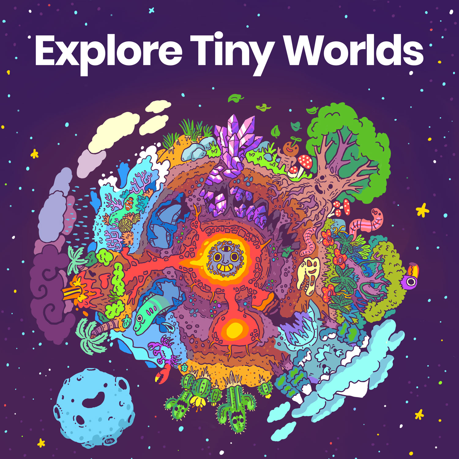
A big thank you to one of my favorite artists Erb for tackling this. Erb is always incredible to work with and has that amazing ability to see inside my head and capture my vision for projects. Erb has also done work for my two (Lush Sunlight and Explore Tiny Worlds) music playlists on Spotify and Apple Music.
Here’s a before and after:
Original icon on left, new icon on right.
I really wanted a hand drawn icon to reflect some of the new toon shaders I’m using in the game. I also felt like a drawing could help bring the character to life and make it more visually engaging. I didn’t give Erb too much direction, other than the original icon and some screenshots from the game.
I’m absolutely thrilled with the result. I love how the ghosts are incorporated in the background, and how the lantern (you know, the actual main mechanic in the game!) is included. We went back and forth a little bit to get just the right level of detail in the icon, while maximizing readability at a small size. Below is the progression of the idea. I think what we landed is on right there in the Goldilocks zone – juuuuuust right.
Erb’s artwork progression from initial sketch to final icon.
I was also able to sneak in a few quick bug fixes and improvements. I’ll probably talk more about this later on, but I had the opportunity to speak with some folks from Apple about Wildwood and they gave me some great feedback on the game that really helped solidify the next few year’s worth of updates. The bigger items we discussed are still a ways out, but I was able to tackle a few low hanging fruit items they suggested. I also added in a very basic pause button suggested by a reviewer on the App Store. It’s a little rough, but it works! Finally, I fixed a bug with Game Center score recording – there was a logic issue that wasn’t currently affecting how scores were sent, but it was affecting the built-in daily ranking leaderboards view in Game Center. In a future release I’d like to surface some of that data up within the game world, so fixing that bug now will help with that later on.
As of this writing, we are at over 1,700 registered players on the leaderboards (over 4,000 total downloads) and I love that so many people have had the chance to play it. The game got picked up by a few websites and had a nice spike in downloads a few weeks ago. That was really fun! That also lead to an increase in the long-tail daily average daily downloads which is cool. For a brief moment, Wildwood was the #3 most popular Family game in Croatia!!
That about wraps this post. I’ve been really focused on other projects at the moment, and I’m excited to share more details on that hopefully soon 🙂
Wildwood: Graveyard Defense – Update 2.1
The update brings new art and greatly improved lantern accuracy.
Apple just approved the 2.1 update for Wildwood and pushed it out to the App Store. This update improves the accuracy of the player’s lantern, and also ended up also including new art assets and switching many elements over to a new toon shader.
Regarding the lantern, originally I was using an arc of raycasts to perform hit detection on the ghosts’ colliders… but for some reason it wasn’t always accurate. Ghosts could slip between the narrow gaps in-between each ray and hit the player. The new method simplifies the approach quite a bit, and uses an OnTriggerStay cone projection out from the player. The result greatly improves the lantern’s accuracy. Maybe even too much! The prospect of re-balancing comes to mind. I’m going to keep an eye on high scores to see how they change.
As far as art goes, this all started with biting off more than I could chew for a single update. Originally I had started work on adding potions to the game which required a new house design for the player that includes a cauldron! A potions system quickly turned out to be much more complicated than I thought, so I put that on pause for a moment. I left the new art assets in and worked on squashing bugs and fixing the lantern instead. I also integrated a new toon shader. The result is a bit brighter and more colorful.
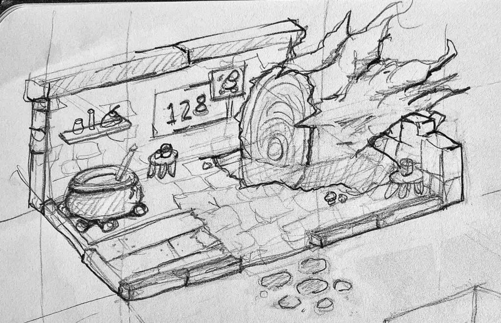
A concept sketch of the player’s new house design complete with a cauldron for potion brewing.BeforeAfter
Overall, I think players will enjoy this update – especially ones that may have had trouble with accuracy issues in the past. I hope that it’s more approachable for newcomers too. If you’re interested in seeing to roadmap for this game, check out this page (at the bottom). If you want to play, download it on the App Store now!
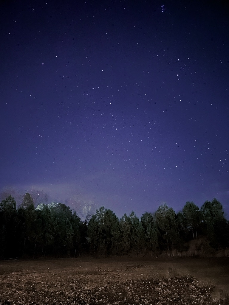
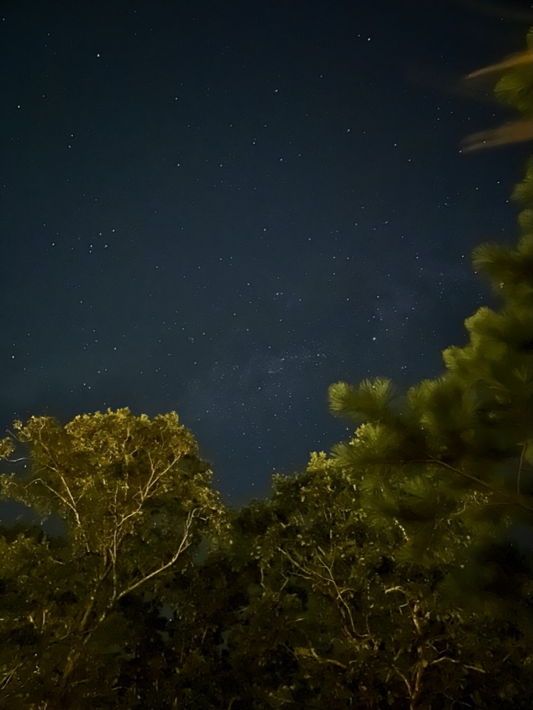
Star Photography Experiment #3
It’s been nearly 8 years since I posted any kind of star photography here. The first two posts (here and here) are a little cringey to read, but have the right kind of spirit.
Back then, I was shooting on a Canon Rebel something or another, with a standard lens. The result was a blurry, mostly black and white picture of dots haha. This time, I’m just shooting on my iPhone. These little pocket computers are magical.
Even a hint of Milky Way in this one.
What really surprised me, aside from the obvious drastic improvement from my last venture, was the amount of color information the camera was able to retain. I wonder if I had a newer DSLR if I could get a better result. I’m not so sure I have enough knowhow for that. All the fancy AI-based computation that’s going on in the phone to take a clear picture is just stunning, and let’s someone like me who doesn’t know much take a decent picture point and click style.
TUNIC: 7 Years… Worth the Wait
“Oh!! THAT’S how you open the door!”
That was me, late one night, after wandering around the world of Tunic for hours wondering where I was supposed to go next. It was a brilliant moment, and I was so proud of myself for not just Googling the answer.
Tunic is a wonderful game. Everything is thought out. As a player, you know nothing and aren’t just rewarded for exploration… you are required to wander.
And for those of us who love to pour over the lore, and read every little note and diary entry in a game… well, that’s a primary feature in Tunic. Some players might be able to fumble their way through the main game, but good luck. And this hits on the thing I love the most about the game… the manual.
At the start, I thought collecting pages to the manual was more of gimmick, albeit super cute and fun. No. I salivate over finding pages now. The manual is literally part of the game. Required reading. Full of hints, secrets and further on, cornerstone pieces of the story line. And let’s not even get into only having half of a spread revealed and just KNOWING that once I find the other page, it will unveil something amazing. Almost every page has amazed me.
I don’t want to give anything away.
If you’re interested, check out TUNIC immediately. I’m 30 hours in at this point, and can easily see myself putting in another 30.
Making for Fun
2021 started off in all the wrong ways for me. Throughout 2020 I felt like I was living in some kind of special bubble shield. The pandemic, working from home, social distancing… I didn’t realize the day to day toll it was taking. Life seemed somewhat normal despite those things. Then all of a sudden, it didn’t. And my mental health absolutely collapsed. A few months later, and I’m still pulling myself back up (with the love and help of others).
I realized I needed to take some time to do fun things with no strings attached. No goals. No timelines. No need to finish. No lofty ambitions – just the joy of making things.
What do you like to make for fun? Games? Art? Music? Food? Videos?
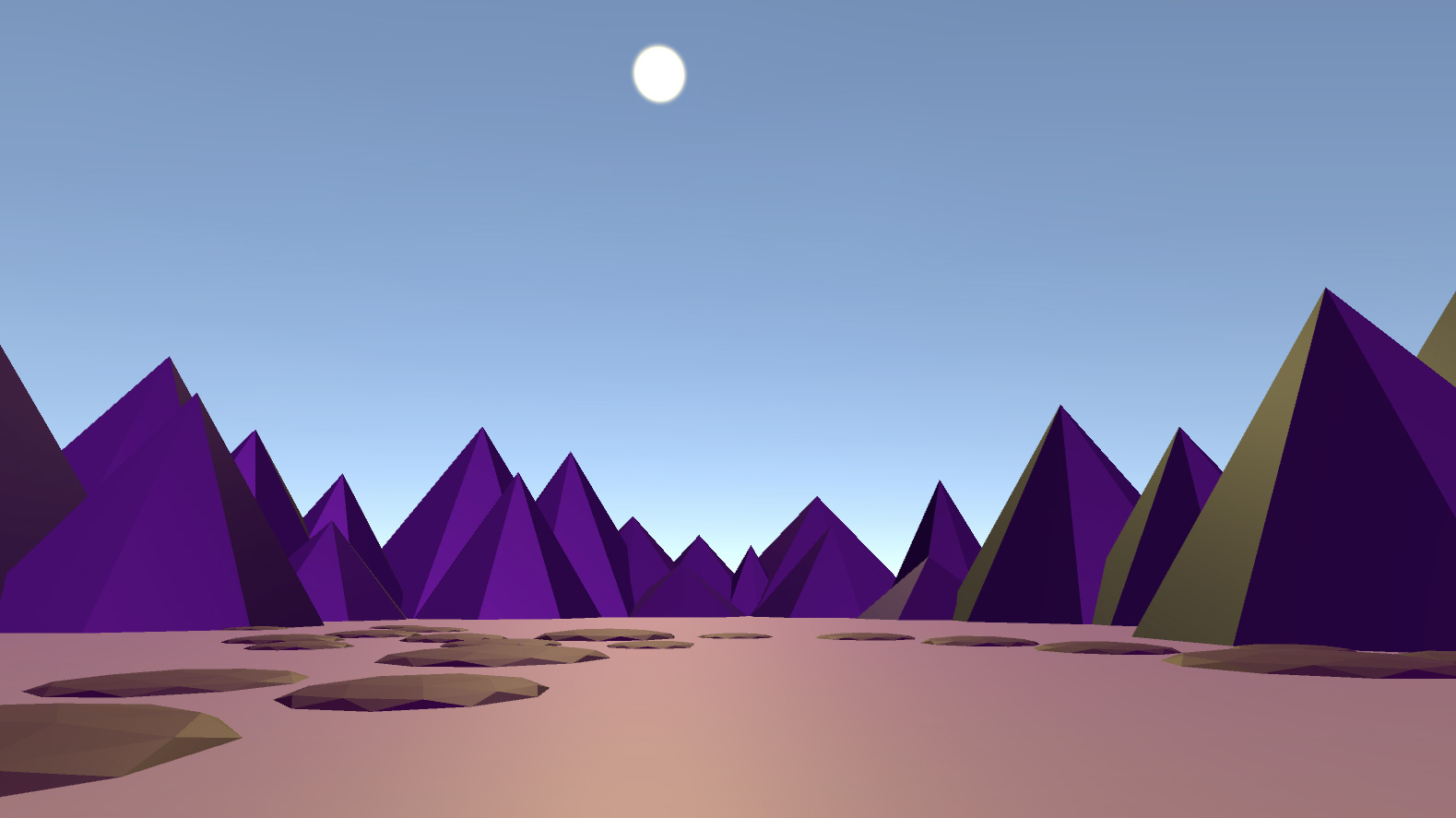
For me so far, it’s been art. Specifically, cute landscapes in Blender.
I’ve been learning so much too as a side effect. Shader nodes, sculpting, particle systems… BUT. One distinction I want to point out is, this education has been a by-product of the fun. Not a goal. And I absolutely KNOW that if I had set out to try to LEARN NEW THINGS… I would have failed. Or at least gotten frustrated and put it away.
Why is that? I don’t know. I’m not even trying to figure it out anymore. I’m just having fun for now 🙂
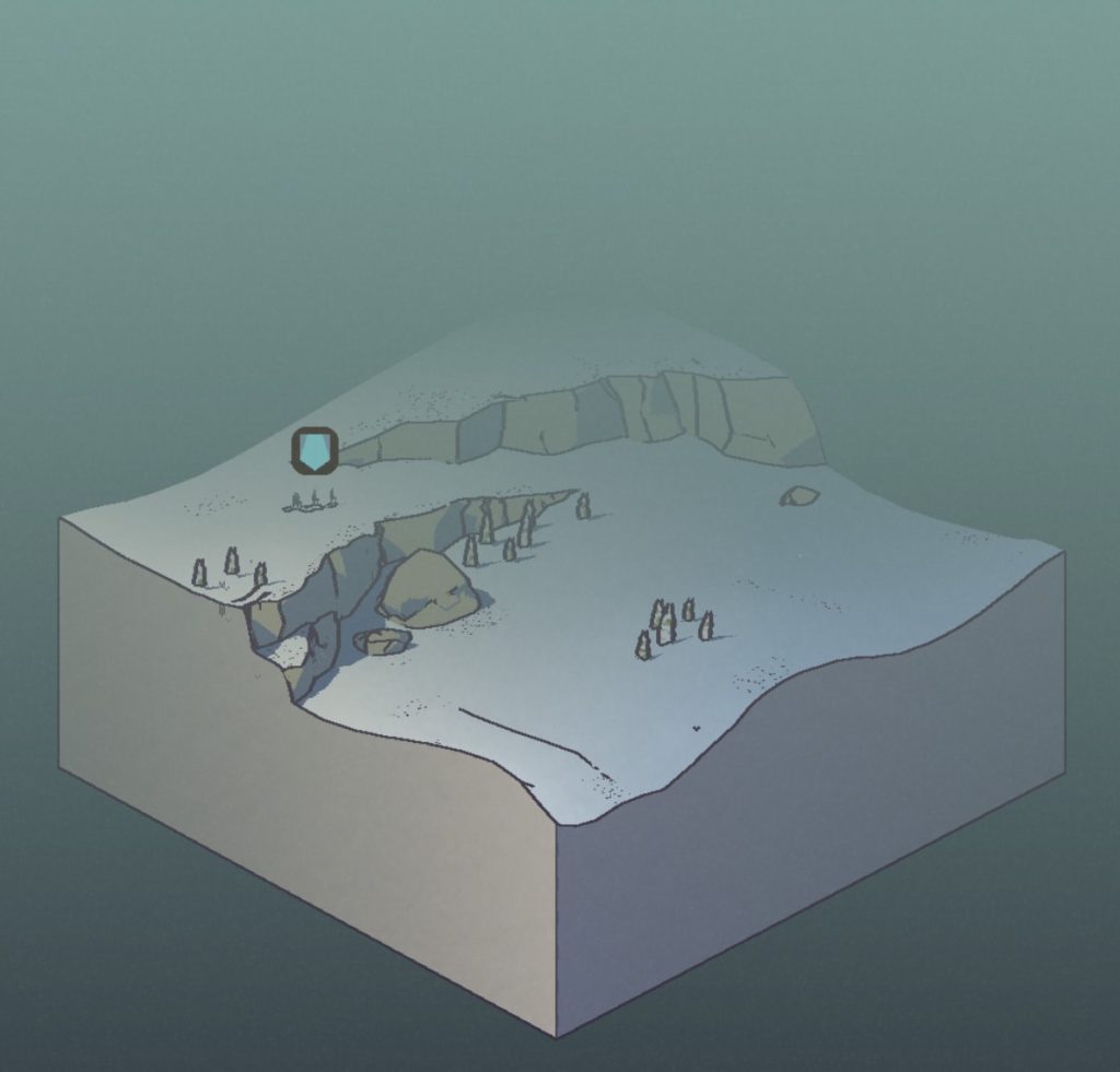
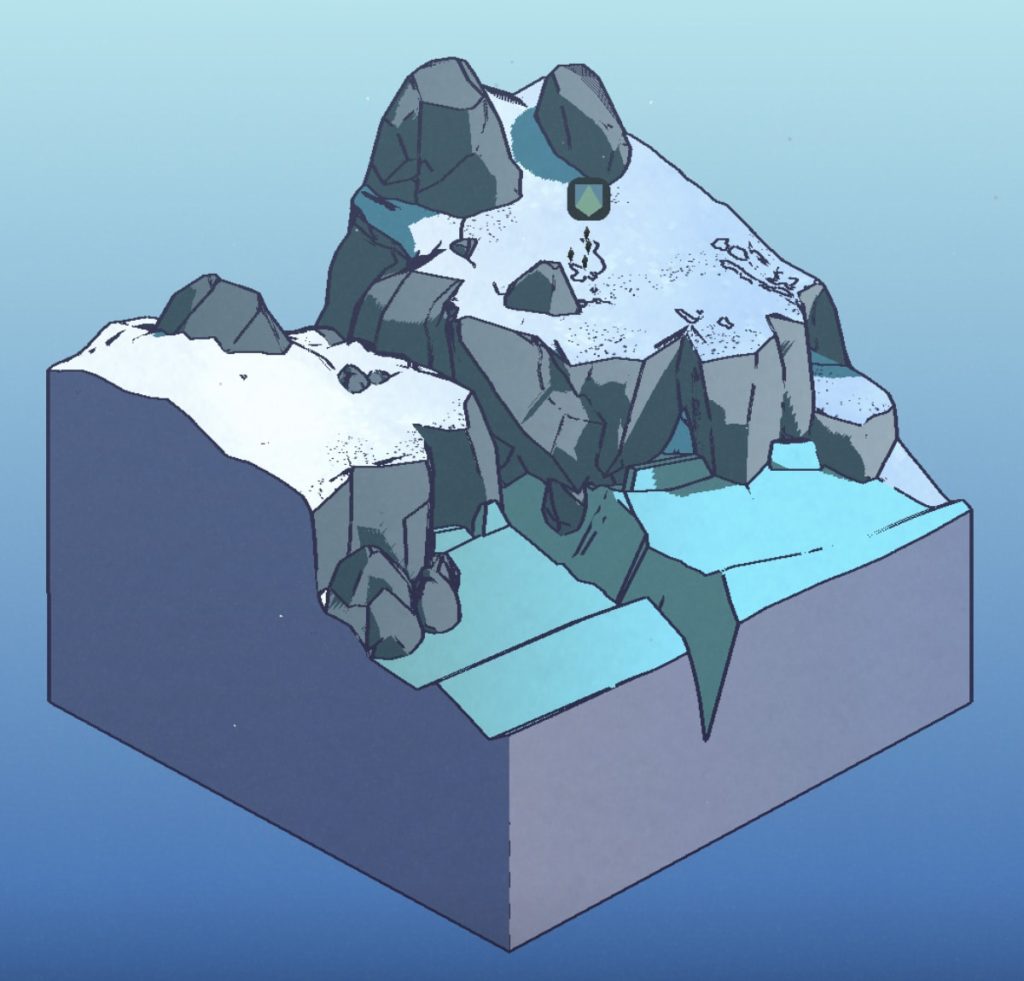
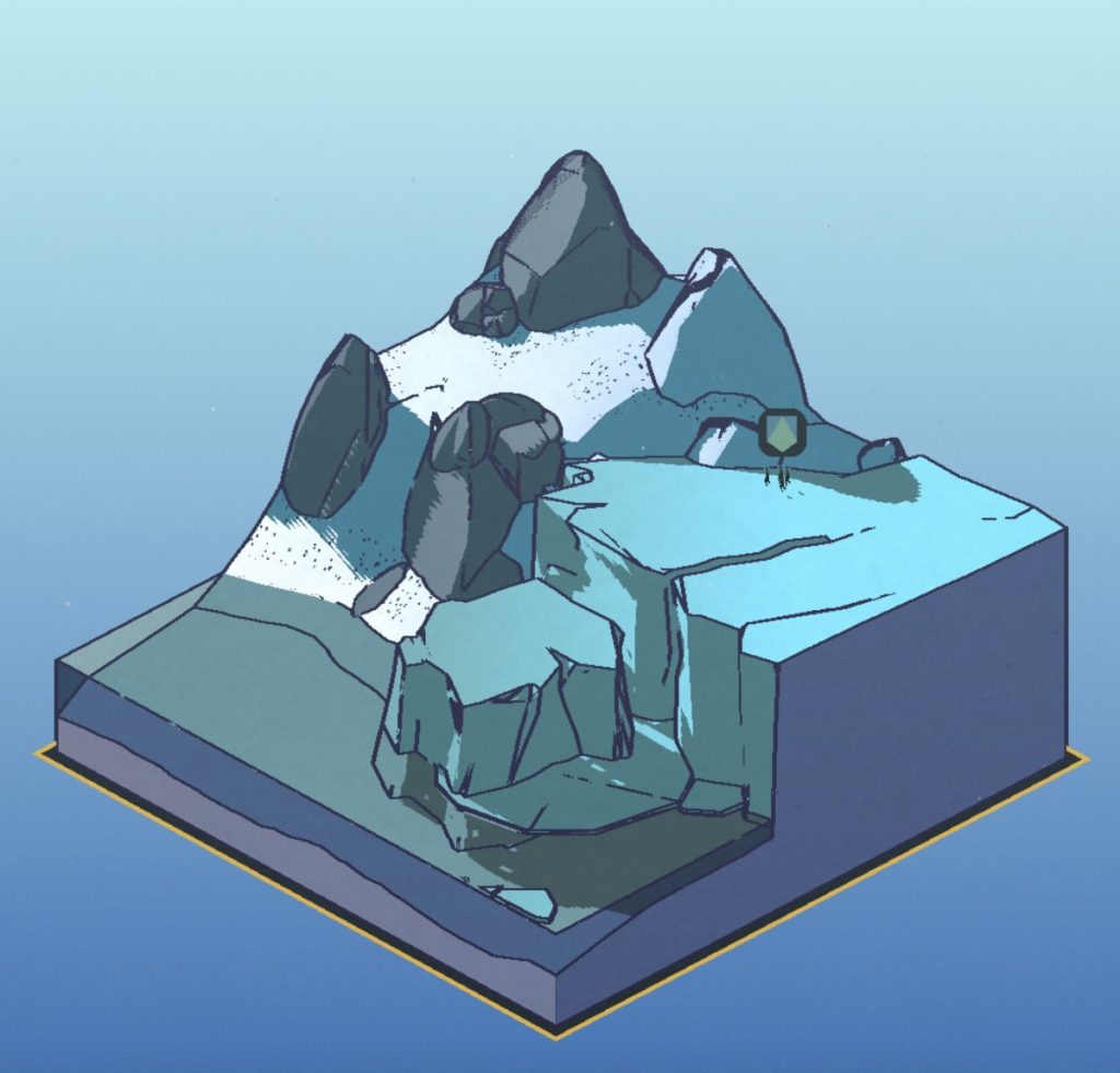
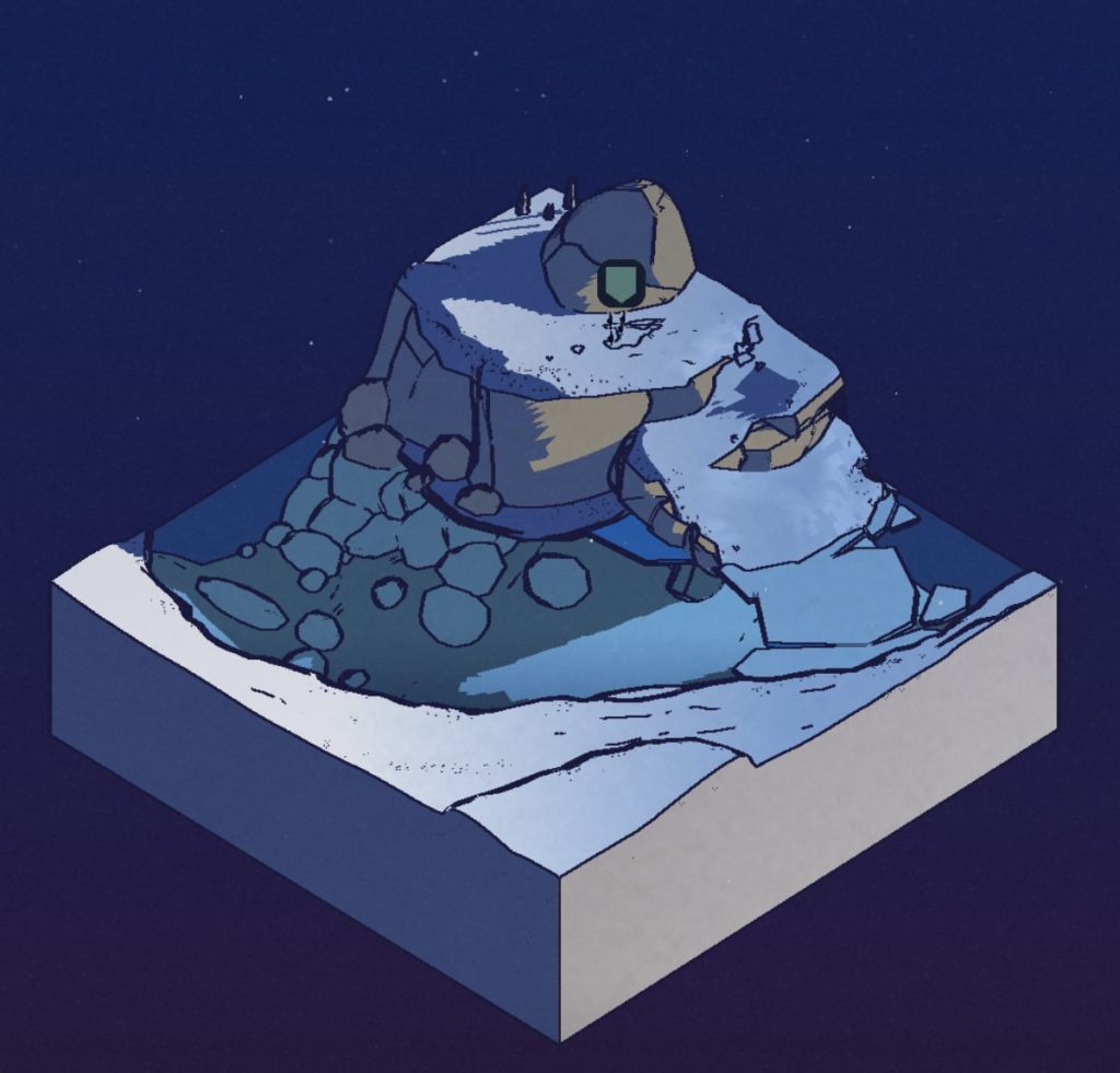
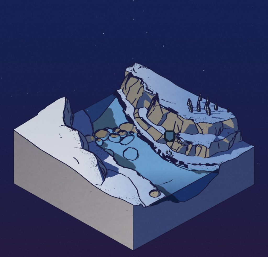
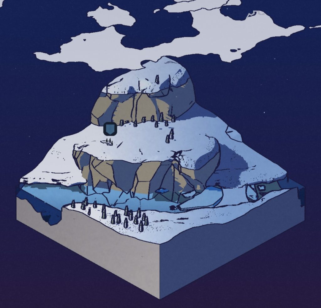
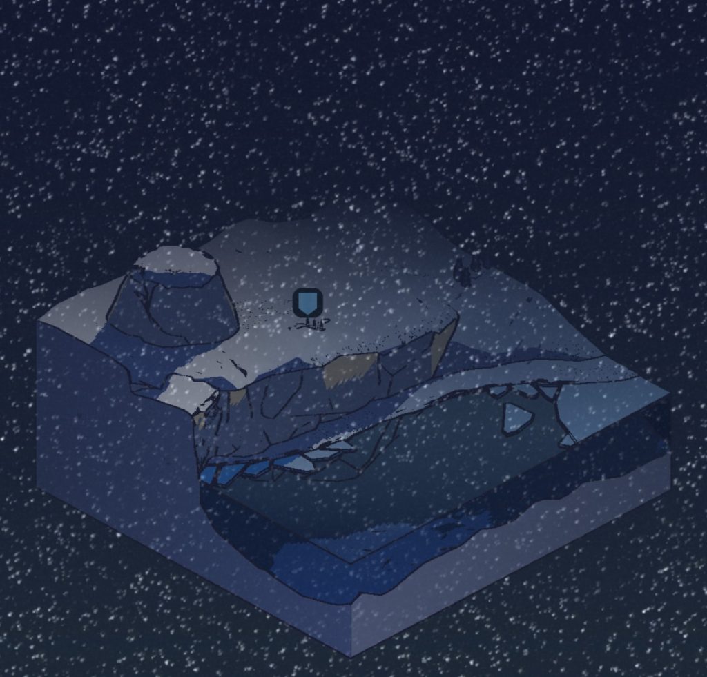
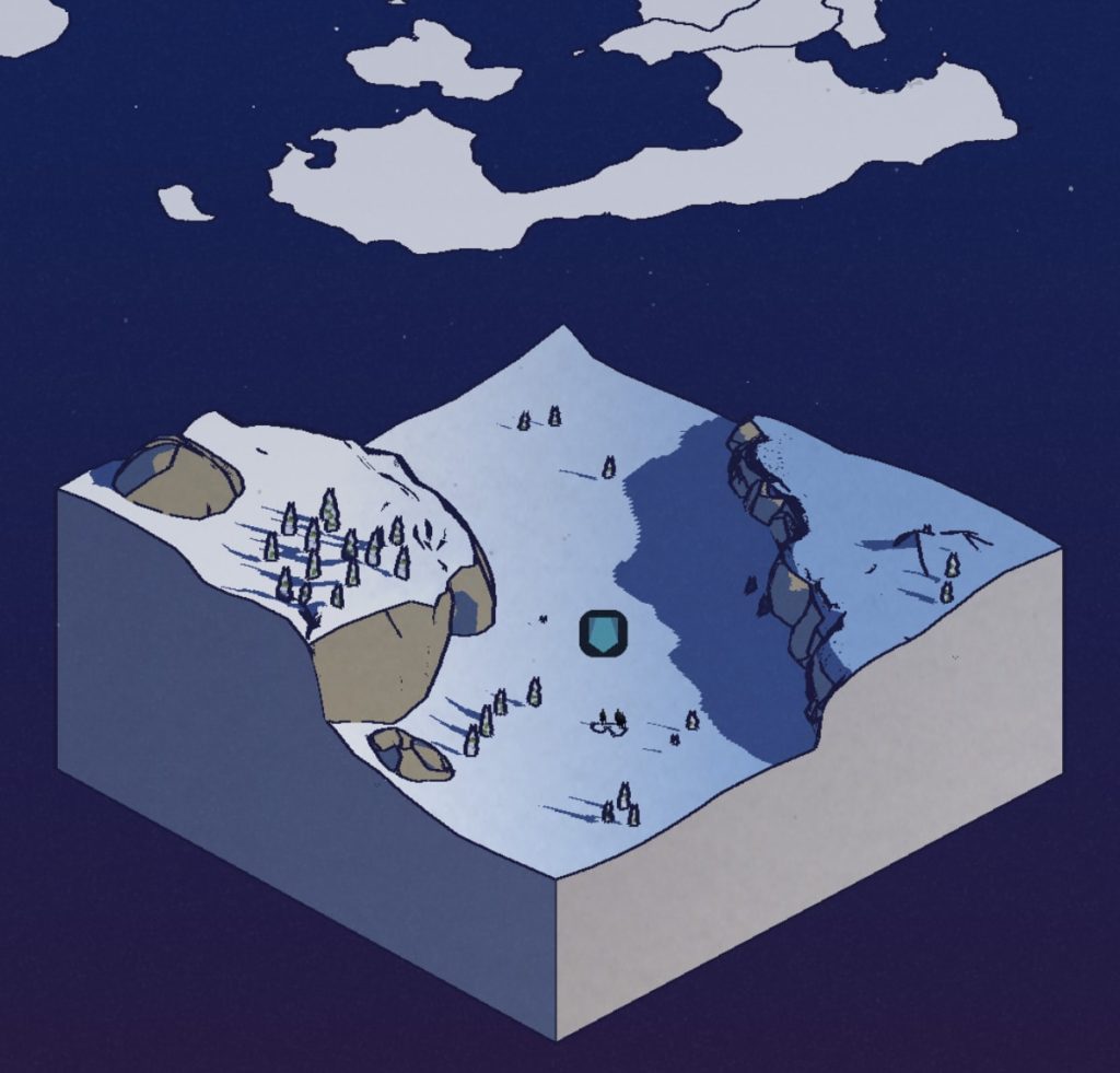
Game of Thrones: Tale of Crows — Environment / Level Design
I’ve enjoyed playing GOT: Tale of Crows since it came out a couple of weeks ago. Sometimes I feel a little lost in it (I’ve never really watched the series or read the books), but it’s immersive none-the-less.
The main gameplay loop revolves around sending expedition teams out beyond the wall. An isometric, 3D slice of terrain is used to illustrate the random events players encounter.
I love these designs. I’m all about some stylized dioramas, and I’ve started collecting screenshots of my favorites.
Mobile Game UI Examples from Knighthood
I wanted to take a moment and share some UI elements from the game Knighthood, a new(ish) game from publisher King, developed by Midoki.
I just started playing it, and it’s a solid mobile game. The combat is decent – it’s a kind of turn-based, combo maker-esque style with what appears to be lots of depth in terms of inventory/gear and summoning strategy.
But what I’ve found most charming, is the UI. I know, I know… typical designer. But honestly there’s a nice mix of things happening in this game. And it’s super polished too.
The Overworld Map
Ok, I’m a sucker for overworld map design. Knighthood has a fully 3D (although non-zoomable) overworld with cute, low-poly art assets, great color design, tasteful particles and weirdly realistic clouds that float by. And can I just highlight the location/town text drawn on top of the map?? It’s gorgeous.
The Starter Pack
Ok, this one is very nicely done, and rightfully so. According to Swrve, 72% of all revenue generated by a freemium player is made within the first 72 hours. So, Knighthood hits you with the classic “Starter Pack” once you’ve gotten a taste for the game. The $4.99 price point is a sweet spot – enough to earn decent money for the dev, but not so much that players are put off. The better designed the pitch for the ad is, the more compelling the purchase. Note the 60% off tag, the +600 FREE gems, and all the confetti and shiny-ness.
Loot / Card Reveals
I’m not quite sure what the call this one, but the loot screen is super enticing to interact with. Taking cues from Hearthstone, the player flips around cards to reveal the spoils they’ve won from chests and battles. I like these cards because they are a nice mix of 2D and 3D design. It’s a really good re-usable design too for all the different drops you can get. Plus, just look at the JUICE on that pop it does before it turns around.
This game looks cool.
You should check it out! Links to download Knighthood are available on their website.
Playground Lore
The term “Playground Lore” is a label for how information (in this case, video game mythos and/or rumors) is spread among people.
Recently, I was thinking back to warm, spring days in elementary school. Hanging out on the playground with my closest, nerdiest friends — we gossiped about video games, and shared stories about our best accomplishments. (For better or worse, publicly viewable achievements in video games didn’t exist then. Being unable to verify the claims made helped create part of the magic.)
One friend was enthralled with Mortal Kombat, and would share his experiences learning button combos (especially secret ones that no one else knew about).
Another would swear to me that Luigi was on top of the castle in Super Mario 64, and that he’d even seen him (on another friend’s system of course, outside of our group).
A third would tell of exotic Pokemon that were hidden deep inside of the code in the games (then Red and Blue). We would later discover most of these were just screenshots from the website Pokemon Factory.
So, is playground lore anything more than just childhood exaggerations?
Consider this: playground lore instilled in me a passion for gaming that has lasted my entire life.
It doesn’t really matter if Luigi had actually been on top of the castle or not (Orrrrrrrrr… at the top of the Volcano in the basement fire level). What that rumor did do was encourage me to try to find all 120 stars in Super Mario 64. It let me discover all of the great (and real) hidden surprises and secrets in the game.
As a game developer, I wonder if it’s possible to create a space for an experience like that to exist again… or if these things just have to happen on their own. Or if they can even happen at all anymore.
The internet has changed things.
If 10 year old me had had a magic rectangle in my pocket… well, our group probably wouldn’t have had much to talk about. If there are literally tens of thousands of videos online that I can watch someone else get a 100% completion goal for a game, why should I bother spending my time doing it in order to see the “secret” end credit screen?
Maybe playground lore just isn’t relevant anymore.
Or maybe, as game developers, we can bring a tiny piece of that back by making gameplay a little more unpredictable, or by carefully obfuscating information inside our games.
In recent memory, one of the best games to have done this was Minecraft.
Minecraft didn’t have a strategy guide immediately. The team at Mojang didn’t detail every release with a walkthrough. Heck, even all the stuff you could craft was a mystery to most players. The small community at the beginning (circa 2009ish?) would post recipes for items online, but only once they had discovered them. That was a special time. It was a time of adult gaming for me that had the same sense of wonder and adventure as games when I was a young kid.
Breath of the Wild comes in close at #2. My friends and I all bought it day one, and we had a group text going on were we gossiped like we were 10 again. Each of us would send pictures or stories of things we had found brag about our adventures.
Both of these more recent experiences happened because the internet didn’t have all of the answers yet. Ultimately, playground lore only has a certain window of time to exist in… before the big brain compiles all the data and spits out the cheatsheet.
My question is this: what can we do as game developers to extend this window of time for playground lore to exist in? And, should we try to?
.
.
.
A couple of bonus thoughts: procedural generation is one thing, but it needs to be more varied.For example, instead of every player finding some variation of a procedurally generated level, perhaps maybe only a few players ever find it at all.But is that even feasible for modern games? And how would that affect story or narrative?
At some point this resembles a sort of Icarus tale, and I fear that we will end up chasing this unscalable idea of personalized, curated video game content per player. Perhaps deep learning/AI can solve some of this, but since so much of that is still blackbox, I fear blindly trusting the machine.
Maybe this is why D&D is still so popular. Only the DM knows what will happen, and the answers aren’t online.
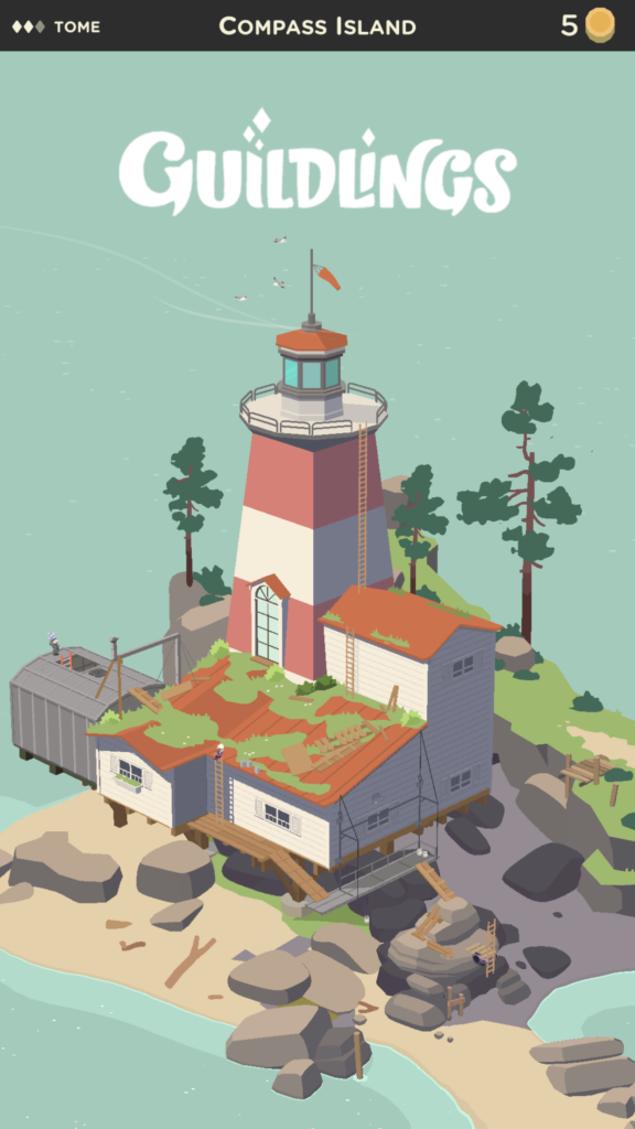
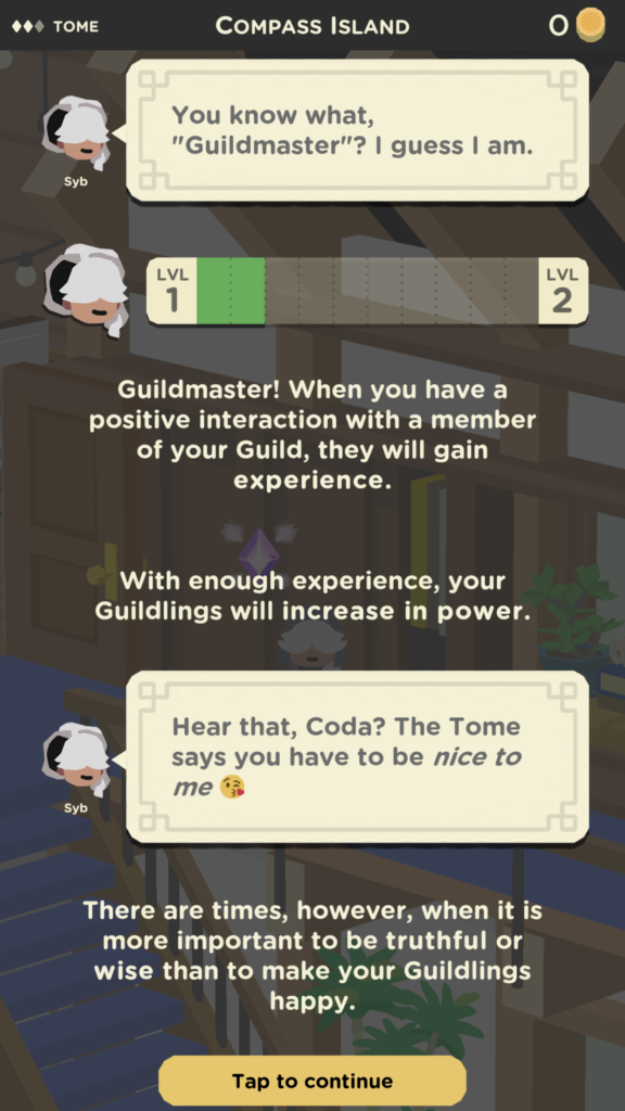
Guildlings… A Game that Keeps Surprising Me
Just last night, I finished Chapter 1 of Guildlings, and let me just say that I am impressed. No wait, scratch that.
*ENTERING PRIVATE CHAT* (Alan) :: ths game is ✨AMAZING✨ ok?? .
Guildlings is well written, clever and witty, visually stunning and turns all the classic RPG tropes upside-down. It’s a modern game that encourages empathetic play and values honesty in your interactions with its lovable characters. The game awards you for understanding scenarios and reading the subtext of social situations. And at its core, it’s a coming of age story… and I’m an absolute sucker for those.
I want to share a few screenshots from the game, but I also don’t want to spoil too much! So if you don’t want any spoilers AT ALLLLLL, don’t scroll down! I mean it! STOP!
Ok, all of you who have decided to stay — proceed forward. Or downward. Whatever, this is your screen. Do what you want LOL
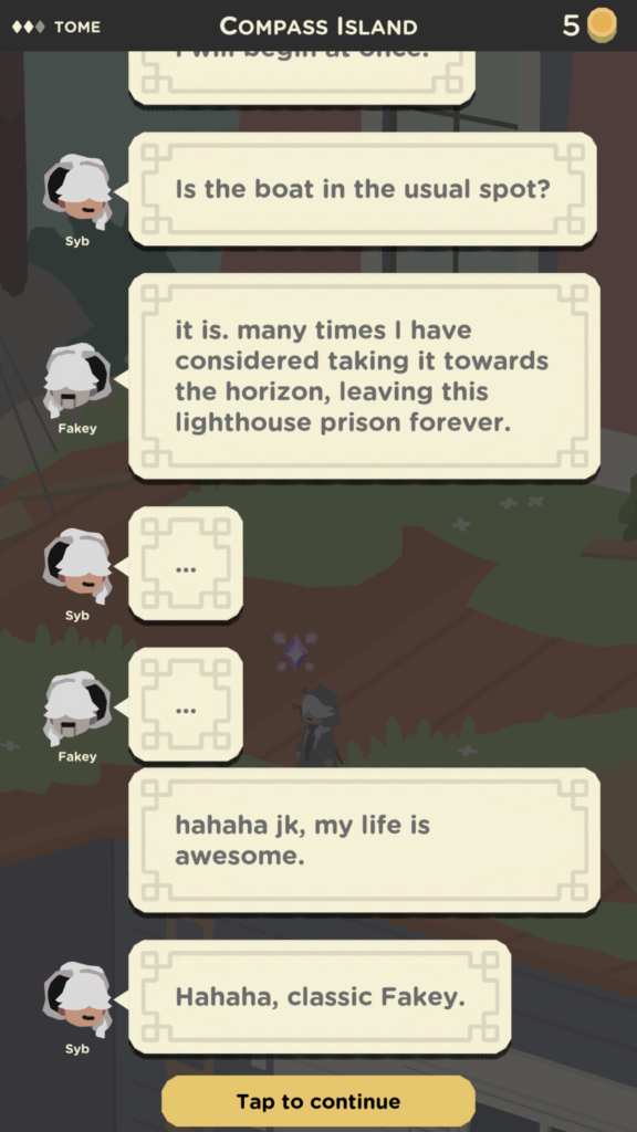
The title screen is presented probably 30 minutes into the game, if you take your time exploring. Onboarding is really great in Guildlings. It’s a great balance between teaching and just letting you play.Dialogue between characters is presented in a text-message-esque style that allows for personalities to really shine through. Syb is direct and grammatically correct. Other characters like Chazzaz are spontaneous and sporadic, favoring emojis and misspelled/truncated words.Visually, Guildlings is stunning and does a fantastic job with the low-poly/flat/tonal color aesthetic. They also do a great job providing lots of detail in scenes, and interactions also use hand drawn 2D art as well! It all works together flawlessly.A perfect example of the writing in the game.
Guildlings is currently exclusive to Apple Arcade, and if you have an iPhone, it’s definitely worth setting up a free 30 day trial to the service. Heck, this game is worth the $5.99 all on its own! The developers of the game, Sirvo Studios, note that new chapters of the game are coming soon. I’m hoping we get one new chapter per month, but we’ll have to wait and see!
The Swords of Ditto is Beautiful
I just started playing The Swords of Ditto on my iPhone and the visual design is incredible. It has that wonderful hand drawn quality and witty art direction that reminds me ohsomuch of Adventure Time. Even the UI is dripping with the same charm, and don’t get me started on the soundtrack.
Waking up on the beach, a-la Link’s AwakeningClean lines that allows themselves to get wonderfully noisy when neededAwesome post-processing effects. Love the tonal shift / light rays in this sceneRain feels natural, but doesn’t get in the way. Lighting really establishes the mood
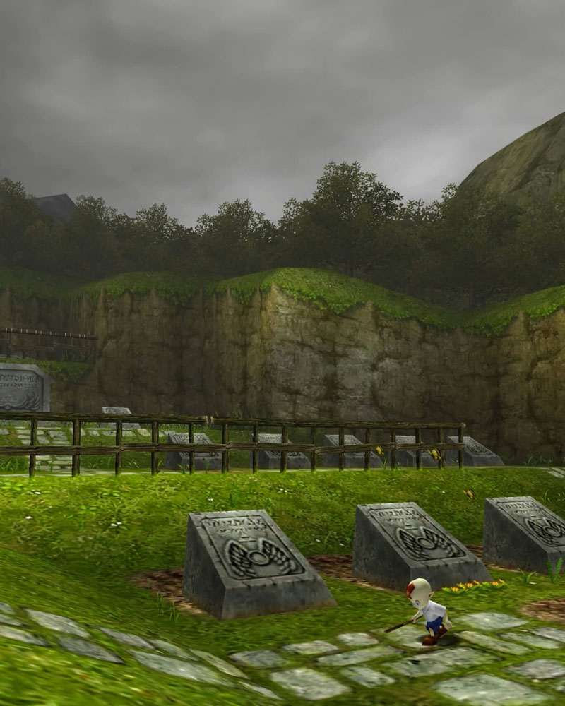
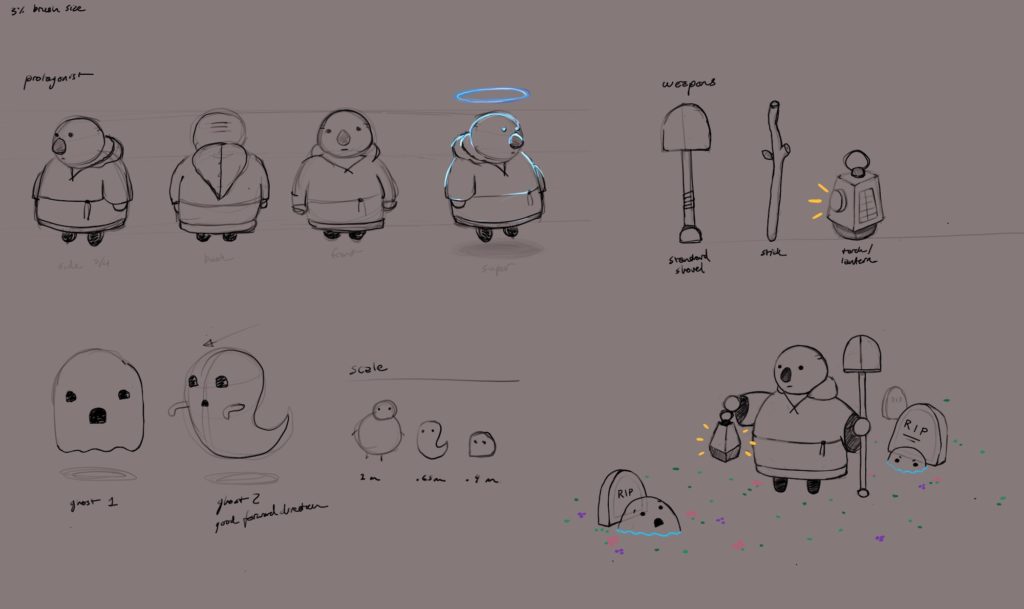
Making a Game: Scaredy Ghost
About 12 weeks ago, I realized that I didn’t know how to make games. Or rather, I had never personally seen the entire process all the way through. I wanted to change that, and hopefully learn something along the way. I did.
It All Started with a Plan
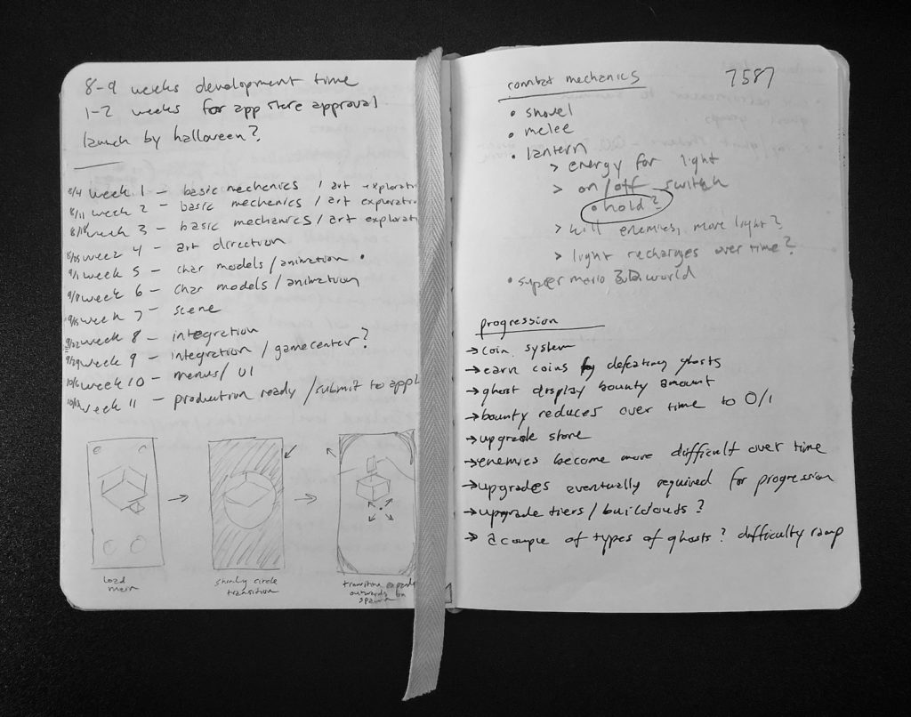
I decided it would be best to map out a calendar first. All I knew was that my deadline would be sometime in October.
I wrote out each week in my sketchbook and left some space for goals next to it. This gave me a framework to build on. Now I needed ideas. And if an idea didn’t fit into the framework, it would get the ax.
My calendar is on the left page. Also pictured: progression ideas that got the ax.
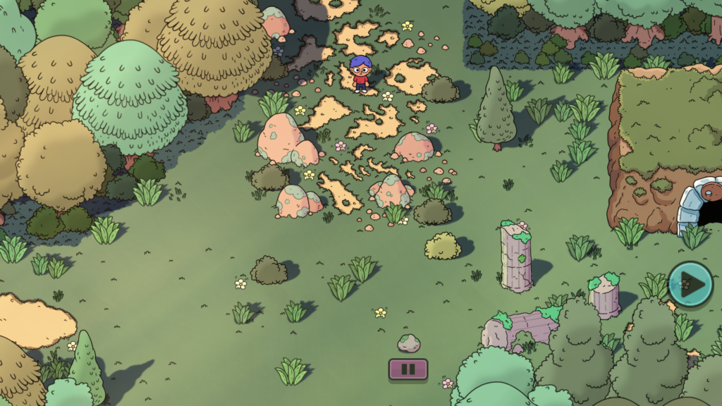
My oldest and I have been replaying Super Mario 3D World. Our favorite levels are the ghost houses, specifically the one where your character wears a headlamp as an outfit and evaporates ghosts with the light.
That was a mechanic I could probably re-engineer on my own. A simple raycast, some glowing particles, and enemies that didn’t need a walking animation — it all sounded good to me!
After a brief consultation with Adeline, we both agreed it would be fun to make our own game using a version of the ghost scaring mechanic in Mario. She insisted on having a house for the ghosts to live in and proceeded to draw me some pictures of *exactly* how it should look.
Luckily, this slimmed-down concept of a game that revolved around a single mechanic fit nicely into my 12-week calendar. This was going to be a nights/weekends kind of thing, so I made sure to give myself as much padding as possible. I wanted to have the game available before Halloween, so I penciled in the week before that to have the game ready to submit to the App Store for approval. Oh yea, I forgot to mention… this game had to ship. A real launch or it didn’t count. That was my goal.
Art Direction
I decided that the first few weeks should be centered around ideation on the mechanic and general art direction. I also figured that since we were basing the mechanics off of Mario, the game should be geared towards kids and adults alike. That special balance where anybody feels ok playing it.
My background is in art, but honestly, art direction is like a whole new world to me. It’s one thing to make pretty pictures, it’s another to determine the trajectory of a style, make big AND small decisions, and figure out how to tie everything together in a cohesive way. And none of this happens in a vacuum. Every element of a game influences the art direction and vice versa.
Early concept sketches of the main character and some ghosts. I ended up moving away from this design because I wasn’t able to rig my own character model properly and had to purchase a substitute from the Asset Store.
What I learned from this process is that art direction is an ever-evolving process. Sure, you try to paint the big strokes first, but in a way… you have to be prepared to make adjustments as needed. And then certain aspects of the project will challenge previous decisions and you need to know if it’s better to stick with your plan, or let change in.
My problem has always been that I’m too much of a fence-rider. I don’t want to make a decision, or plant a flag, because I might be wrong. You have to plant a flag SOMEWHERE. Ok, you might be wrong, and you need to know when you are. But not planting a flag… well, that’s worse.
I’m learning that art direction is a process, just like any other kind of artistic creation. Part of that process is experimentation and failure. And part of it is confidence when your gut says “do it.” I knew I wanted a cute, simple art style in 3D. I wanted a dark scene with highlights of vibrant colors. And I wanted something that I could be proud of.
Building Blocks
Since my strengths are in art and design, and not programming, it was hard to resist the urge to start slapping together pretty visuals. I needed to know upfront if I wasn’t;t going to be able to build the mechanics, so that I could save as much time as possible if I needed to change gears.
Thanks to years of previous Unity experiments, I had amassed a collection of prebuilt assets I could use for testing. Right-click, new C# script, “PlayerController.cs”, and… hmm. I just stared at the blinking cursor. What was a void again?
Not too long before this project, I had purchased a new iPad to do some drawing on, and I had also installed the Swift Sandbox app from Apple. It’s essentially visual tutorials on how to program, and you end up learning the Swift language on the way. I fired that app up and dug in. I kid you not, at this point I either had forgotten or didn’t know that the Update() function could call out to other functions in the file. I mean, that was the first tutorial in the app. My confidence was a little low at this point.
A few weeks passed and I was starting to get the hang of it. I’m an amateur programmer at best, but I can stumble my way through some code and piecemeal concepts together enough to make things work. No, it’s not the prettiest or the most efficient code… but it does compile. And I don’t seem to have any memory leaks according to Xcode… so there’s that?
(Shhh, I realize that Unity is doing ALL the heavy lifting and I’m just basically scripting the layers on the top.)
An early prototype of the game. In this screenshot, I was performing a stress-test to see how many ghosts could be active at once. The answer: more than enough!
At this point, I had a working prototype of the main mechanic. You could control a little character, make them emit a cone of damage in front of them, and little AI nav mesh “ghosts” would try their best to run into you. Done.
Burnout
It was a huge relief to find out that I could manage to scrape together enough know-how to program the basic mechanics. At this point, the rest of the game seemed like it was just icing on the cake. My goal was to slowly iterate on each piece one at a time and polish the experience as I went.
I looked at my remaining weeks on my calendar and noted which items I would work on next: character modeling, texturing, scenery and map design, animations, sound/music, Game Center integration and high score saving. And finally, submitting to the App Store.
I had been spending a bunch of time every night and on weekends working on this project. And I should have realized that I was starting to get burnt out on it. I was also neglecting my other duties at home. Dishes were the most obvious offender. In the next couple of weeks, I would hit a low point and didn’t touch the game for about a week and a half. It was then that I realized what had happened and that I needed to do a better job balancing this work/life/hustle triangle… mostly the life/hustle part.
I haven’t been camping in years and had promised Adeline I would take her on her first camping trip one day. I booked a campsite near our house for the first weekend in October. I also made it a point to start exercising every other day for at least half an hour. I resolved to keep my priorities in check moving forward.
The Last 10% Takes 90% of Your Time
It’s a strange phenomenon, but it’s true…
Once you start to see that finish line, the fatigue kind of melts away and the goal comes into focus. You build momentum. All of a sudden, the endless nights spent working without seeing much progress fade away, and you start saying things like, “Yea, this looks good” and, “Wow, this is actually kind of fun to play.”
And then your work becomes more efficient somehow. Iterations get quicker, which makes room for those, “Oh my gosh, if we do X then I can also add Y!” This is where unplanned magic happens. This is also where some of those random experiments you tried in the beginning, the things you knew you would change later, actually work for some reason.
Remember that house for the ghosts to live in I mentioned earlier? Well, it served no purpose in the game. It was just a random castle thing that sat in the middle of my graveyard. Adeline loved it, so of course, I wasn’t going to take it out… but it didn’t do anything. Honestly, I was just trying my best to ignore it until I couldn’t anymore.
It was around this time that I started to crack and let other people see this secret project I had been working on. Initially, I didn’t want anyone but my wife and kids to know about it… but I needed outside feedback. One day at lunch I gave Matthew a brief glimpse of this thing running on my phone. Thankfully, he wouldn’t back off until I had shown him the game properly.
That day, I was trying to figure out how to design the main menu. I hate main menus… or rather, I feel like they are just a de facto kind of thing people add without questioning why they should, or if there’s a better way.
Matthew had a brilliant idea – use the inside of the castle as the main menu. You start inside and then leave the house when you’re ready to fight some ghosts. He even suggested a diegetic system for displaying high scores inside the house. (I am a huge fan of diegetic interface design, as long as it’s done right and doesn’t impede functionality).
It felt good to bounce ideas off of someone else. I had underestimated the value of getting feedback early on and had overvalued the importance of keeping my project a secret. Artsy kids are a fickle bunch, and for some reason, we hate showing our work early. The work is never good enough to show. We’re afraid of critique, especially when the work is our baby. My pride and stubbornness also played a roll in keeping it a secret… but as I reflect on it, the result would not be nearly as good if I had kept it to myself any longer.
The Finish Line
It was the first week of October and my deadline loomed. This was it, the finish line. Almost there. A few more bug fixes and we’re out the door.
Except that Game Center is a tricky little thing to implement.
After some initial play testing, I knew that my game needed a way for player’s to see other’s scores. Without that component, there was no context for your own personal best score, and why ever play again if you thought you had done decently? To fix this, I needed Game Center integrated at launch.
I spent the better part of that week and into the weekend compiling and re-compiling to try to get Game Center working. I tested a myriad of plugins before realizing Unity had its own Social API that would help you connect to Game Center. You also can only test your Game Center code on an actual iPhone. Oh, and you also need to finalize all your Apple Developer account stuff in order to do any of this at all.
While setting up my developer account, I realized I hadn’t yet created any marketing materials for my game (screenshots, video, copy, taglines, etc) and that I also had to provide a privacy policy for my game! It was going to be a long weekend. If you ever find yourself making an app… don’t let this part go to the very end. Please.
Submit and Wait
I was able to get all my bugs worked out and finish up my marketing materials by Sunday afternoon that weekend. I did one more gameplay test on my phone to make sure my build was solid and hit Submit in Xcode. Then I waited.
The last time I submitted a game to Apple was around 2015? James and I did a game jam thing and made a simple little bamboo slicing game. Before that, it was 2011 and we made an Operation clone called Stitches. There is a certain level of anxiety knowing that your game has to be approved. Meaning, if it isn’t, you have to dig back in and fix what’s wrong, and then wait again.
It took about 18 hours before I got an email from Apple saying that my game was “In Review.”
About 2 excruciatingly long hours later, the followup email came in: “Approved.”
It’s difficult to describe the feeling I got. I was on my way into work after a doctor’s appointment that morning and the emotions rolled in in waves. It was a very real rollercoaster of emotions that started with extreme jubilation, morphed into some chest beating like a full-on maniac… and then ended with a silent happiness.
Post Launch
The initial rush is over now, but it still feels so, so good to have something out there with my name on it. Something very real that I’m proud of.
I have some ideas for version 1.1 that I’m toying around with as of this writing. I want to modify the controls, and fix a few more Game Center bugs I’ve discovered. But for now I’m taking a little break to just enjoy completing this project. It really doesn’t matter to me how many people ever download this game. I’m not trying to go viral, or make any money with it. It’s available for free for now until I think it has improved enough to charge for it. I completed my goal and in doing so, was able to give my friends and family a moment of joy when they played it. And that’s what I love the most about making games… the wonderful feeling you get that only comes with the opportunity to give someone else a change to experience the thing you’ve made. It really is incredible.
I want to thank everyone who supported me during development of the game, to my wife and kids for their unending help and love, and I want to thank anyone who reads this for taking the time to hear my story.
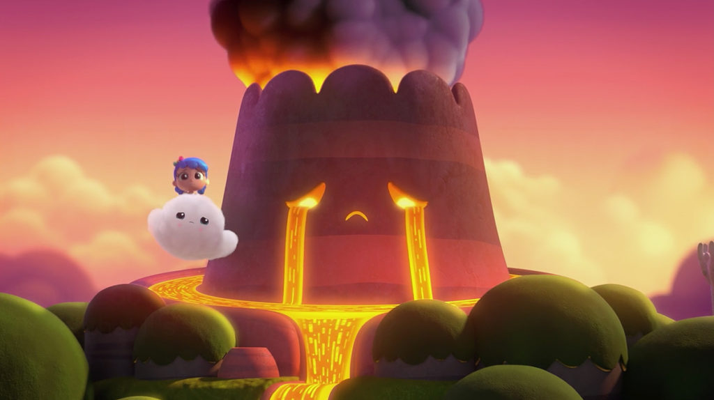
Just a quick note this time regarding one of my favorite kid’s shows on Netflix – True and the Rainbow Kingdom. A new season came out and one episode is about an upset volcano who cries lava. It’s up to True and company to figure out what’s wrong and set things right.
The art direction and design on this episode is spectacular. The volcano itself, Mount Huffinpuff, is so cute and I love all the little details… like how the lava is used for its tears, how it forms a moat around it, and the beautiful volumetric smoke that billows out of its top. The whole environment is incredible and the juxtaposition of the cool greens and blues of the nearby springs against the warm oranges and purples of the volcano make this episode a special treat for the eyes. Nice job True team!
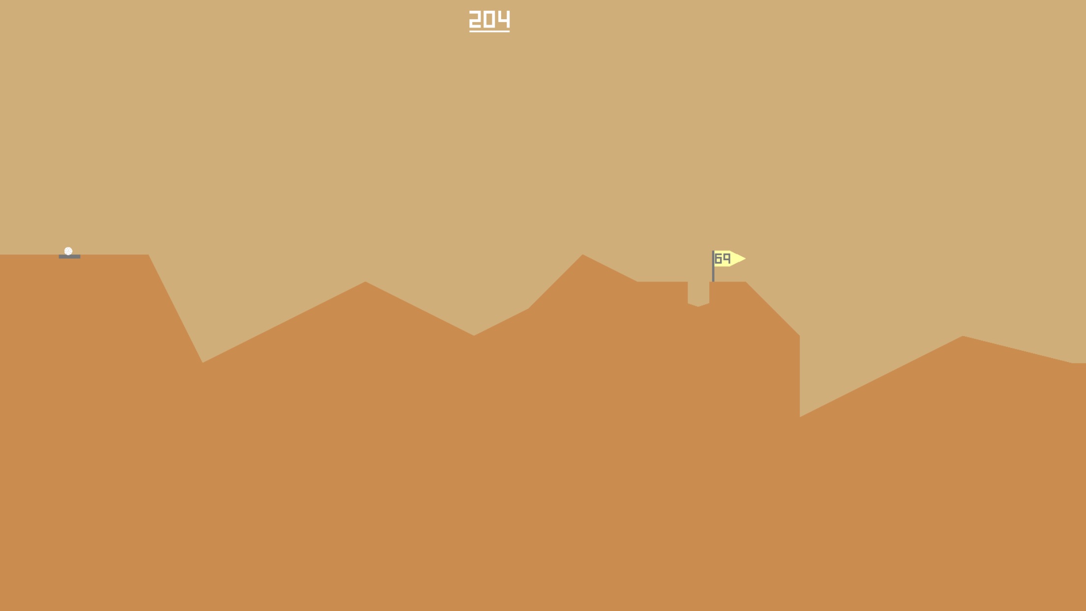
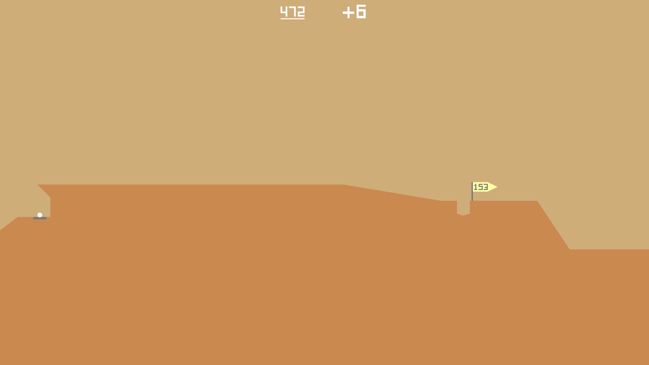
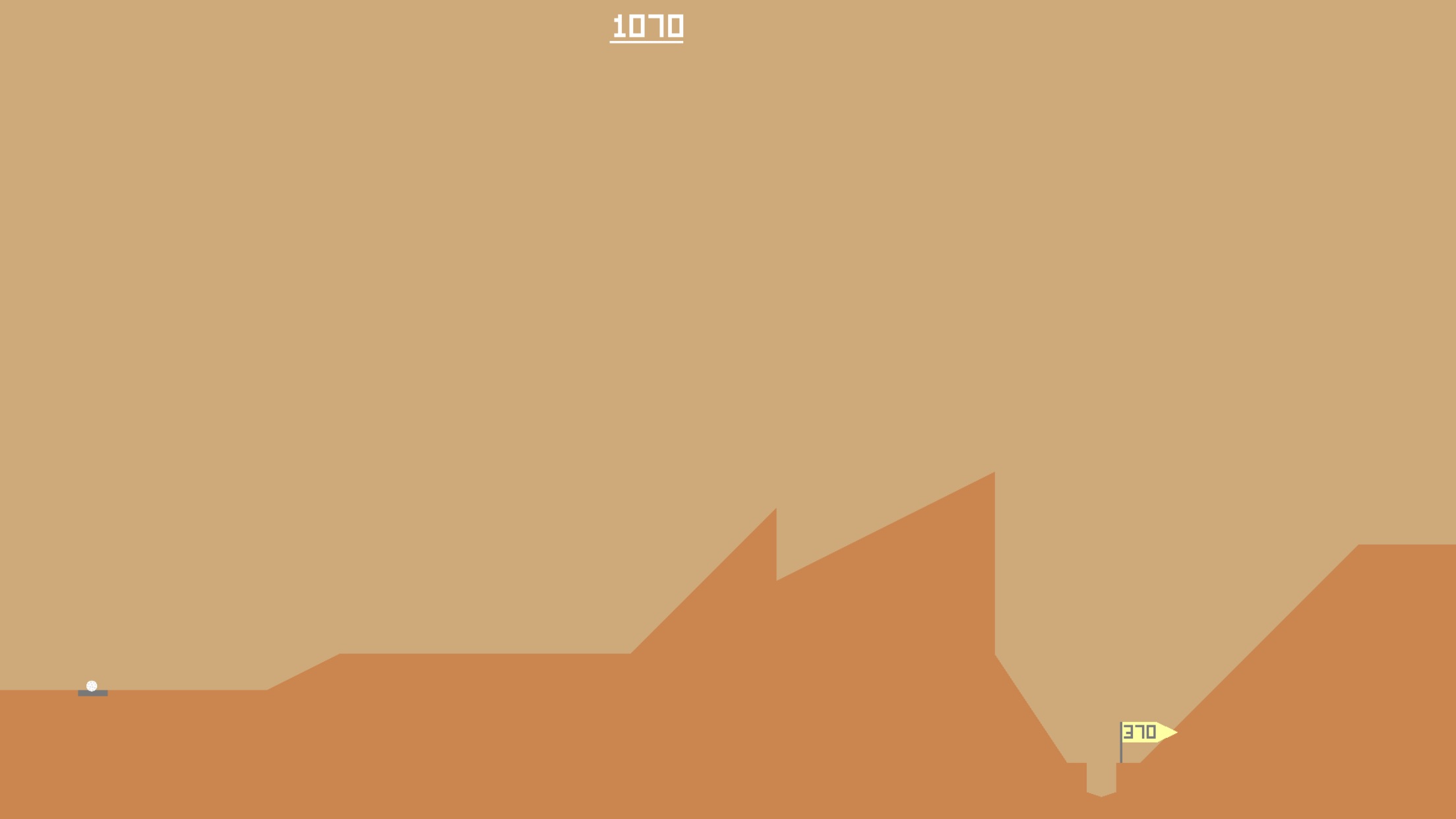
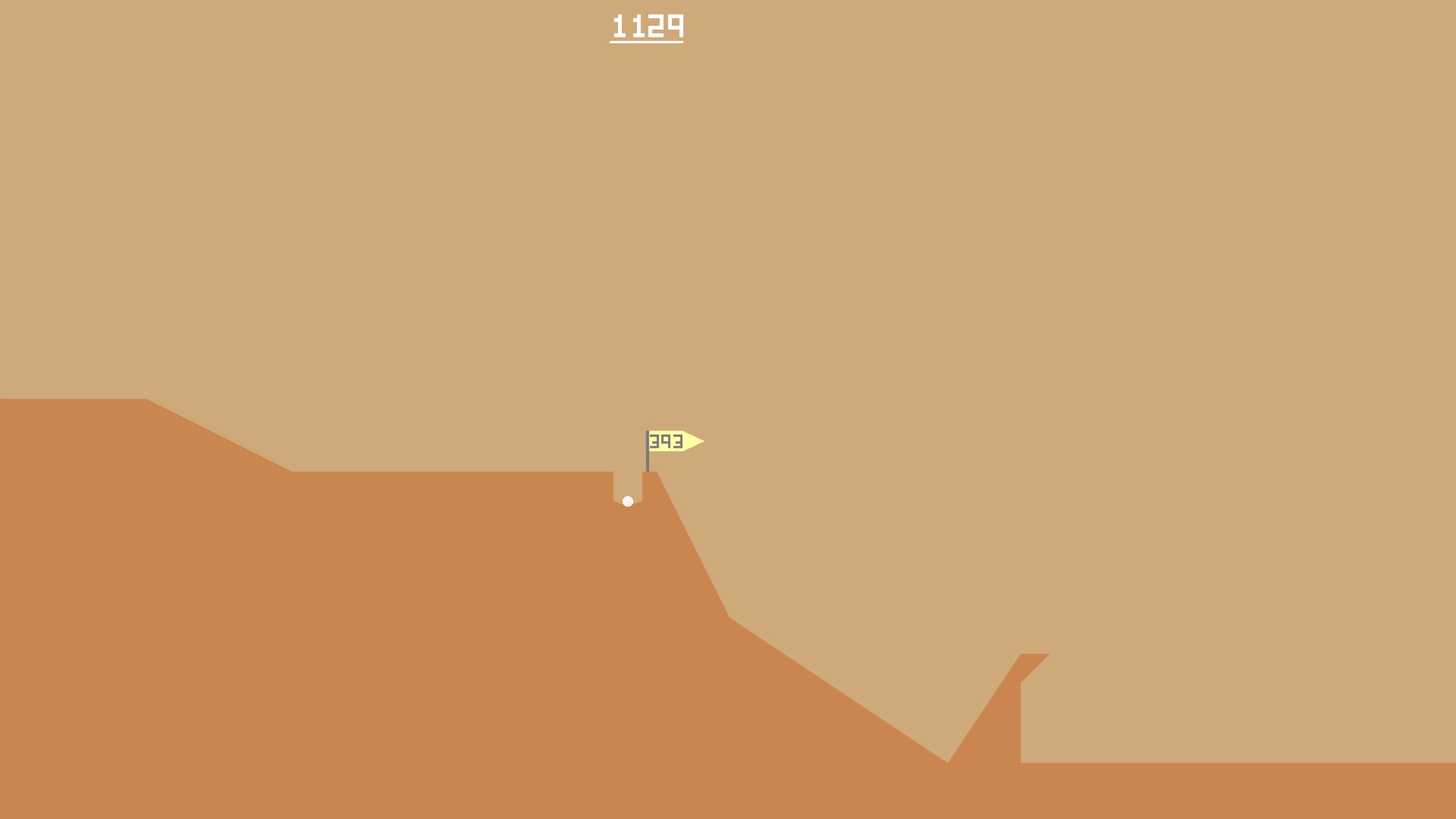
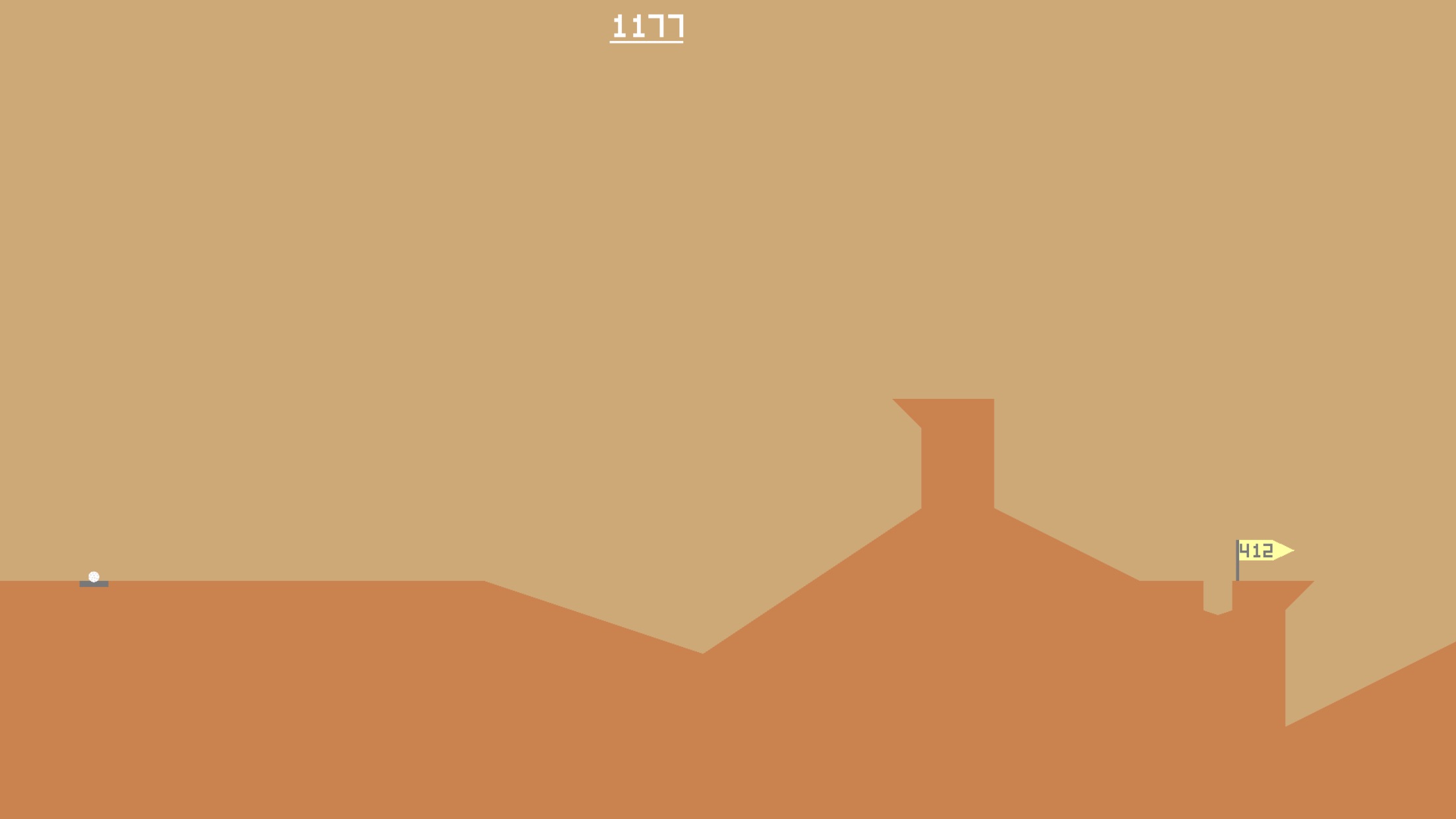
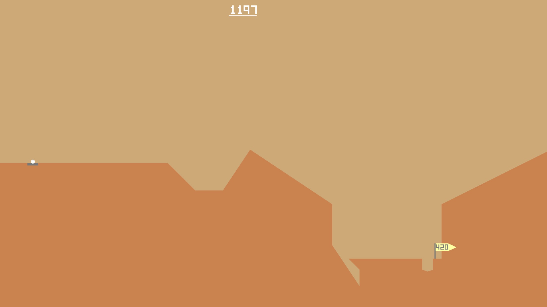
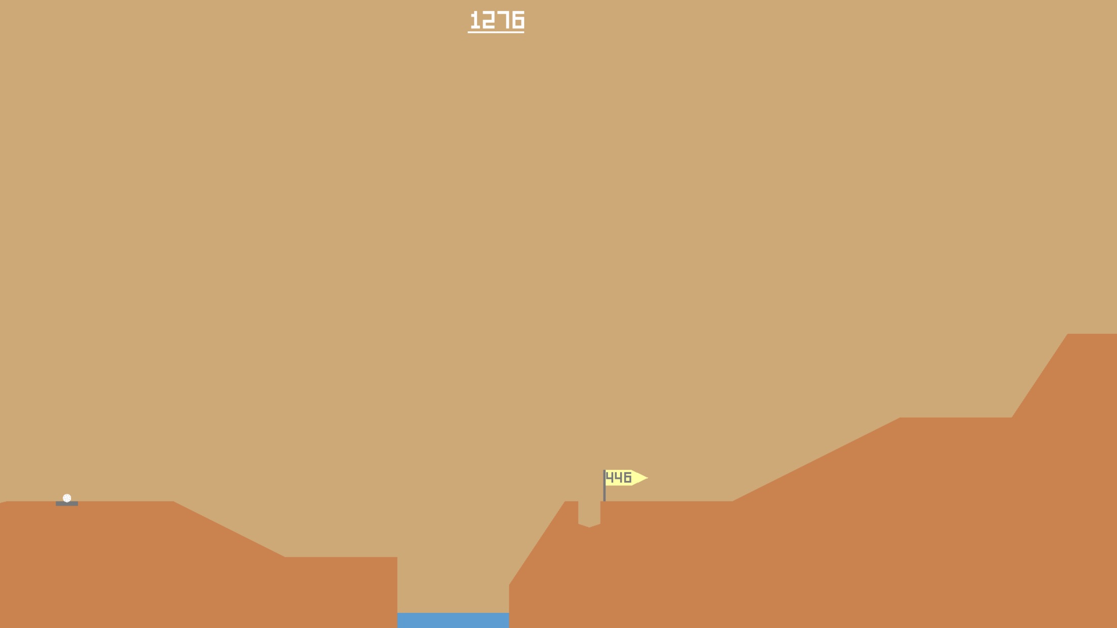
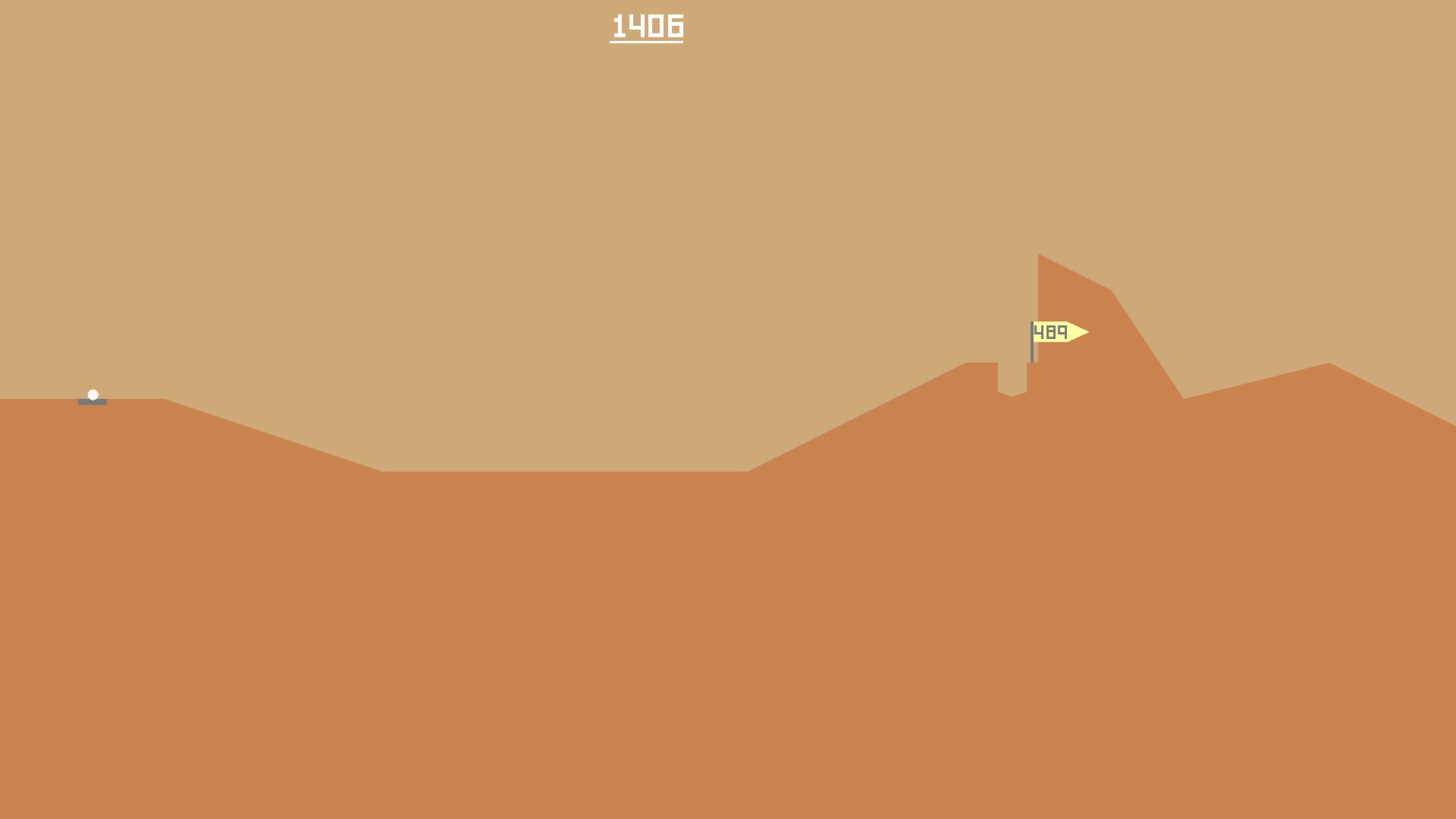
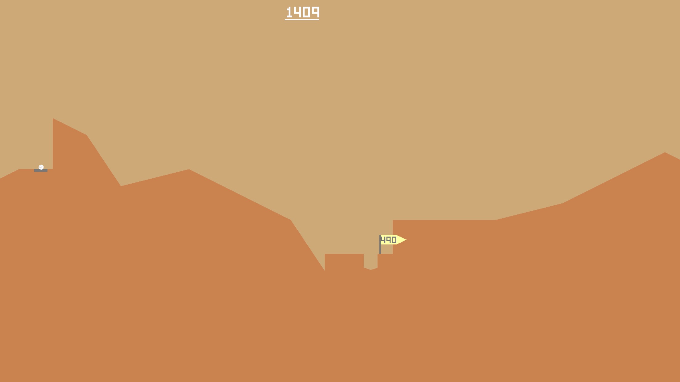
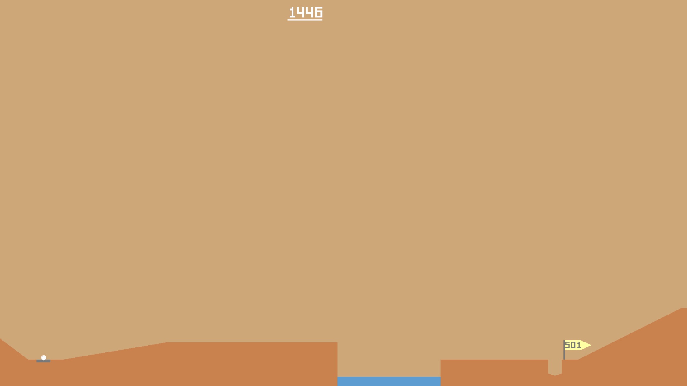
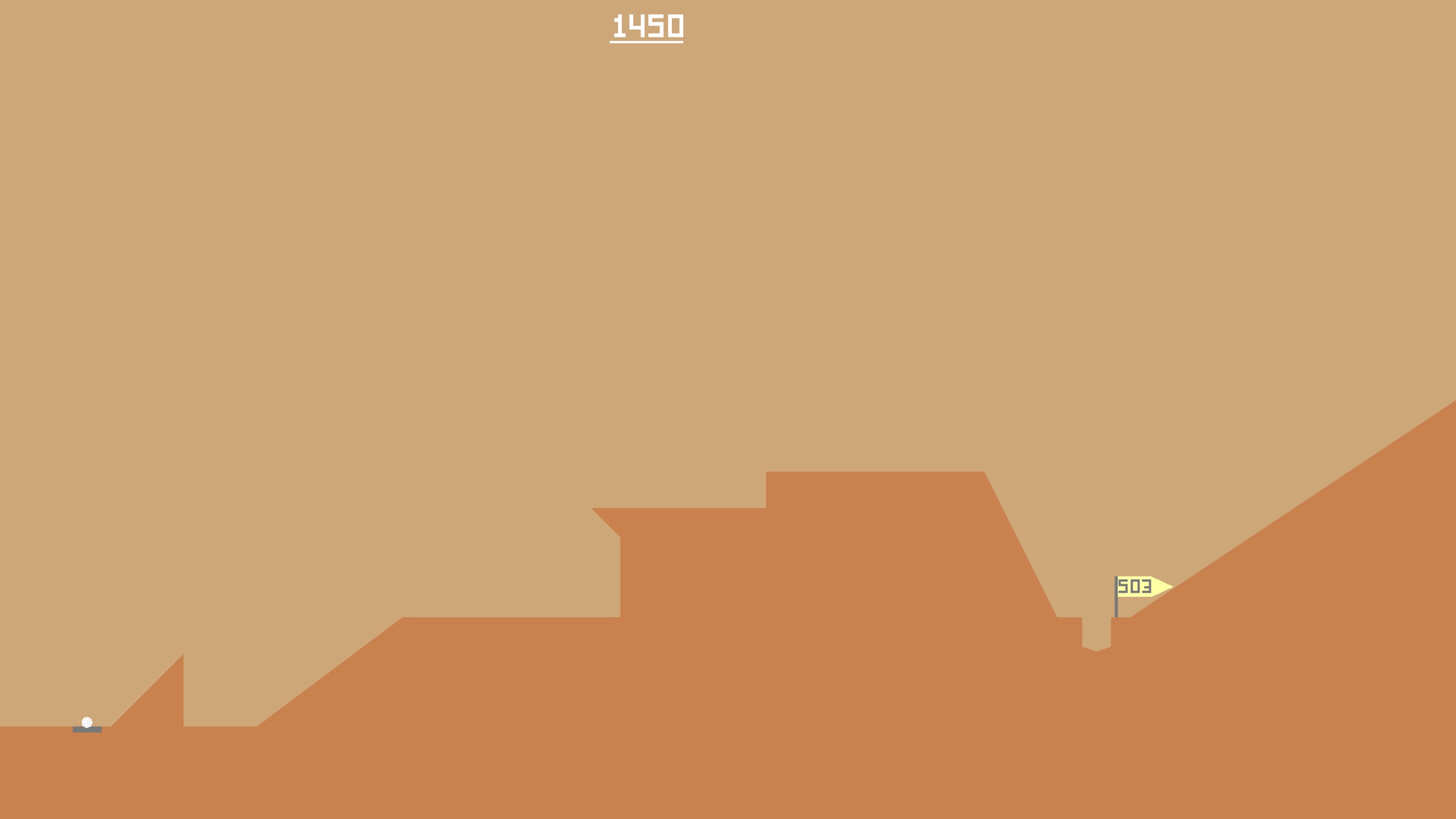
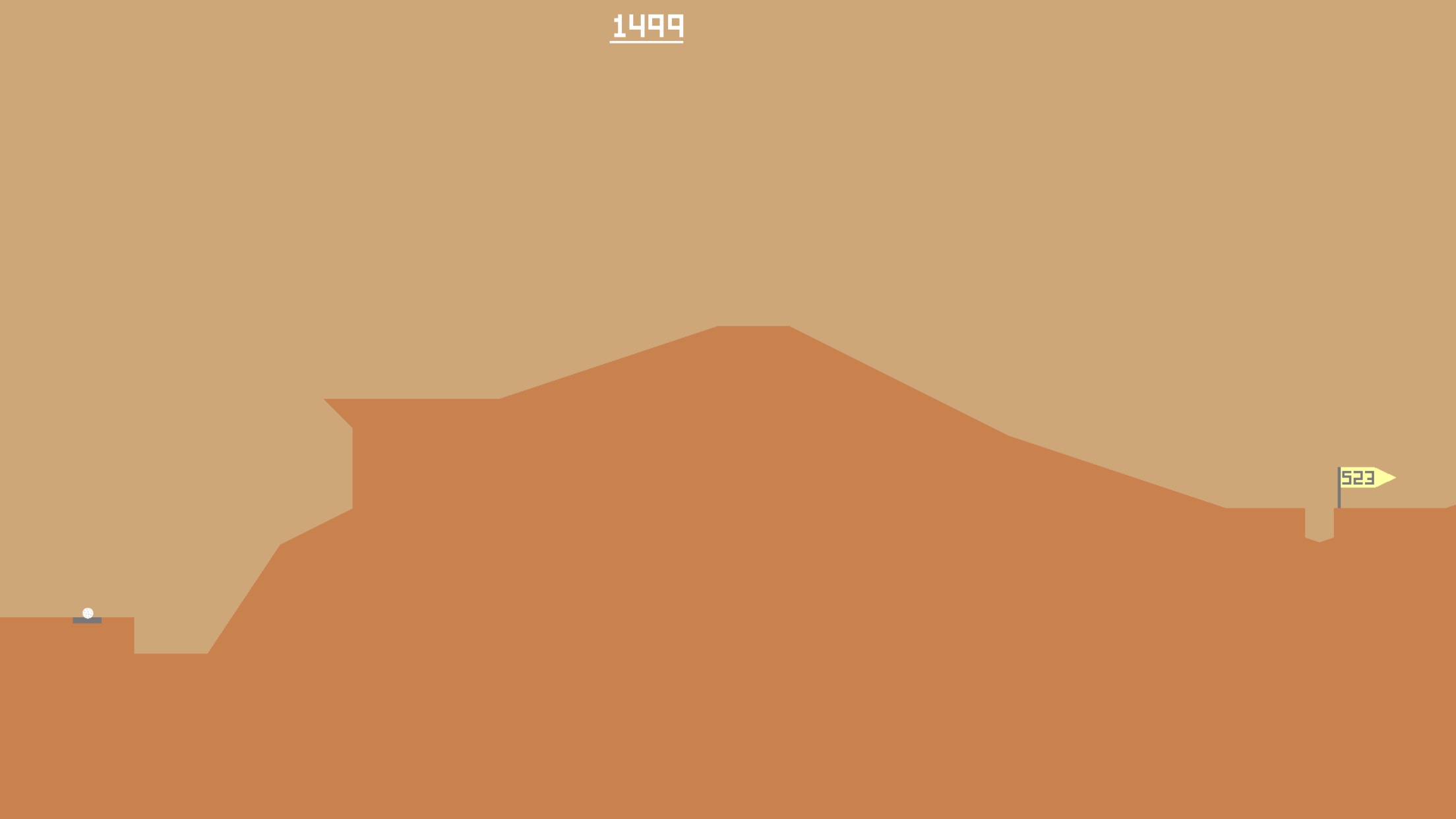
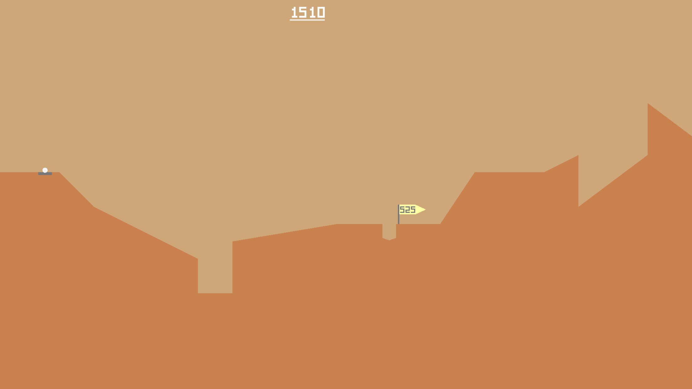
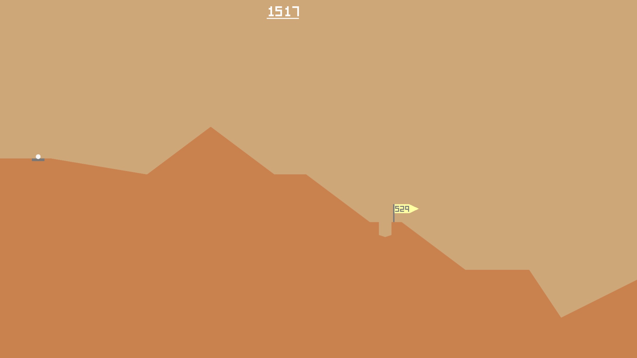
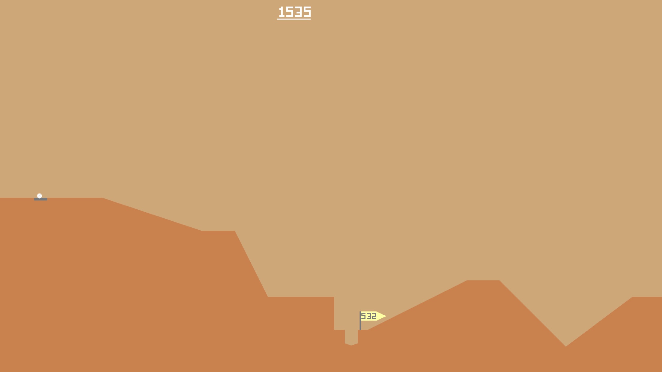
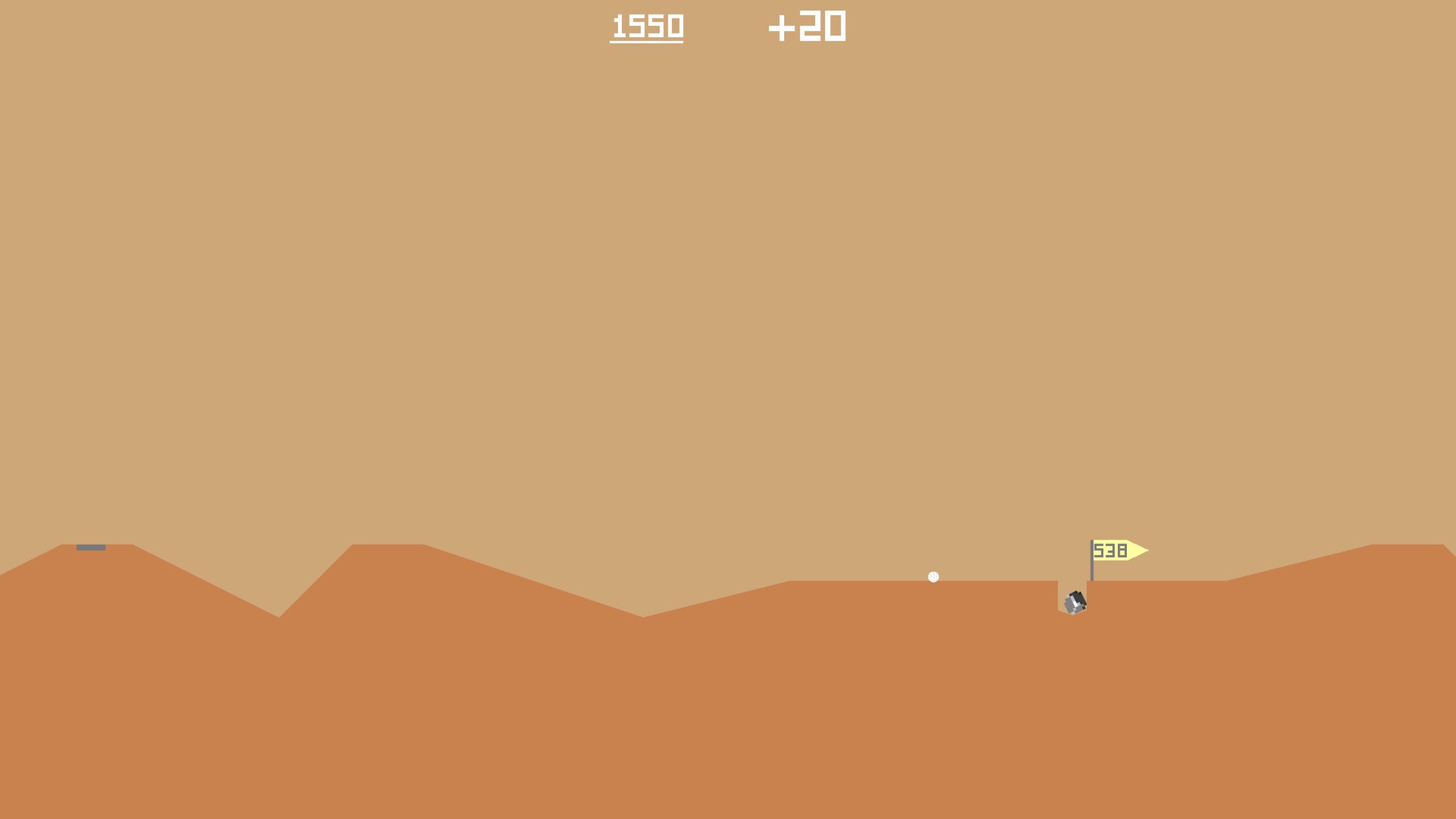
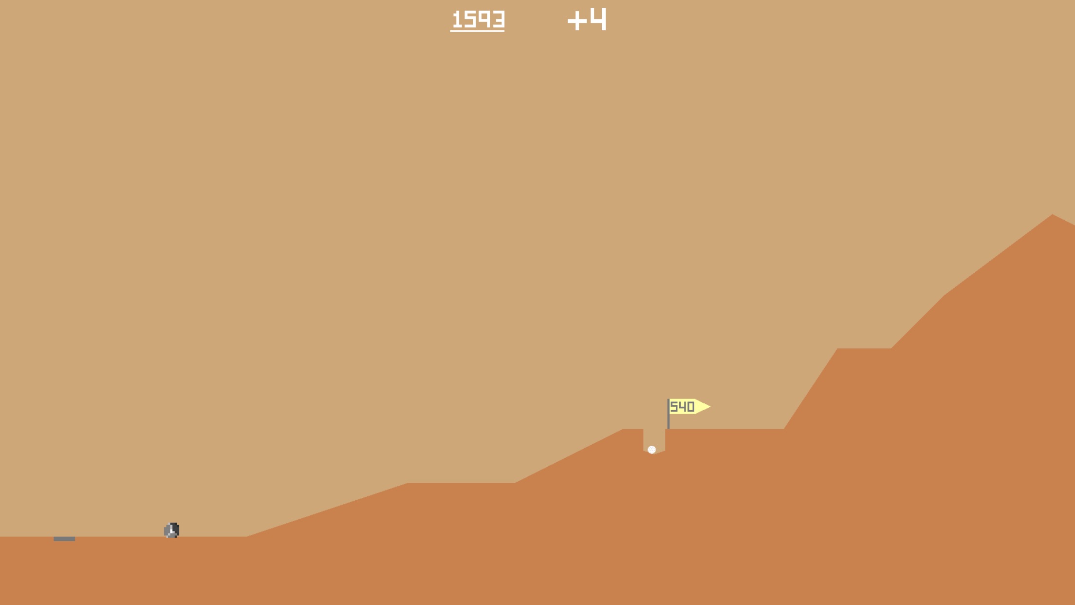
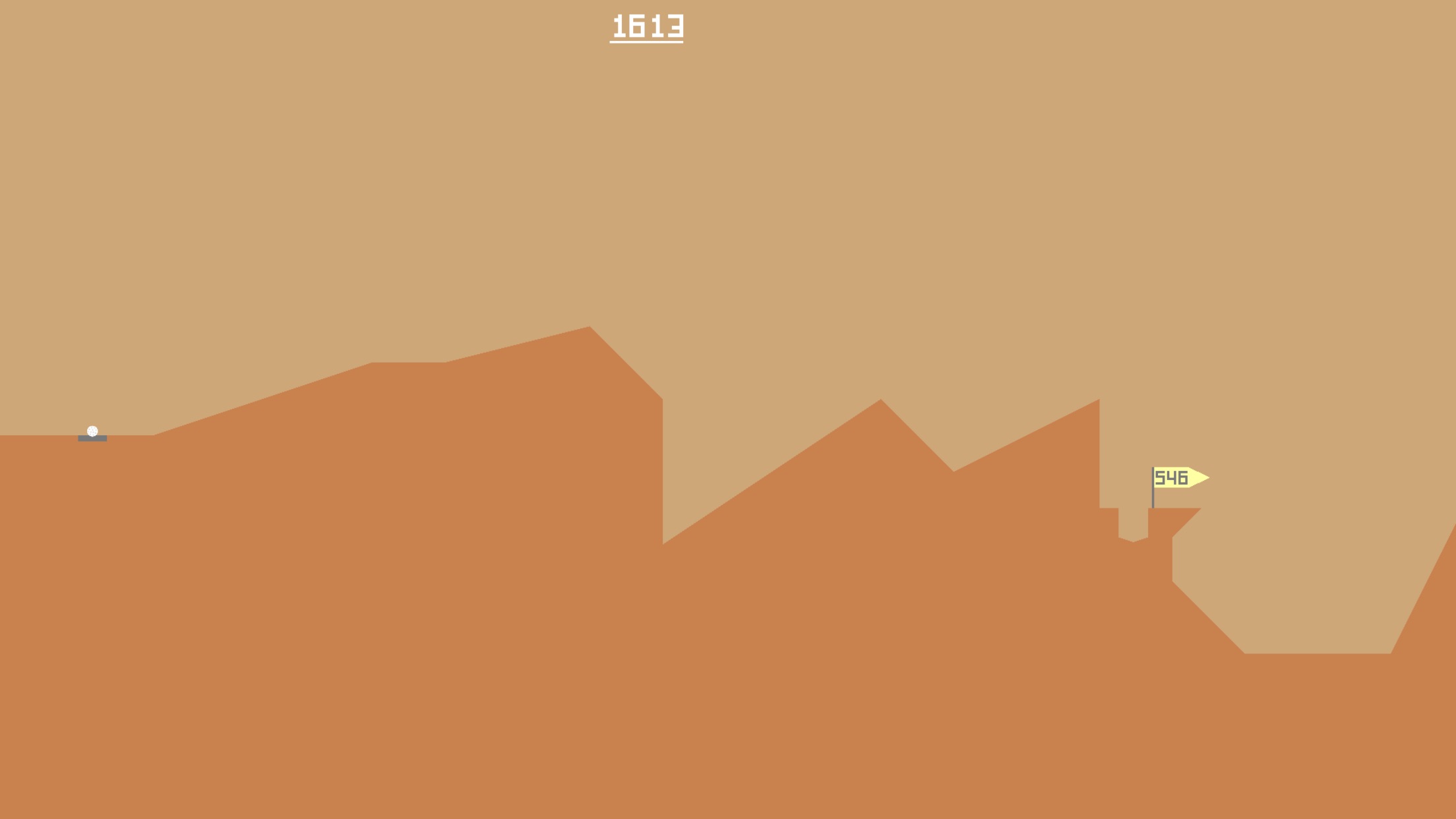
For better or worse, I’ve recently been sinking time into a charming game called Desert Golfing.
This game… it’s… well, it’s unique. It’s a game of skill, sure, but it’s also a game with a good story behind it. To keep the allure alive, I’ll leave that to you to go dig up on your own.
As of this writing, I’m about 600 holes in (an average par around 3/hole, not great but hey) and I’ve stumbled past a few really cool levels. I’ve tried to figure out what it is about some of these levels that intrigues me. Perhaps it’s a mixture of deceptive challenge, or maybe unique land formations. Only a minimum of ~9,400 holes left!
I even tried to take a rock with me. I made it 2 holes before I realized that it probably wasn’t worth it…
Collectors vs Creators
This is a topic I’ve been thinking about a lot recently.
Sometimes I wonder if I confuse myself as a creator, instead of a collector.
To give some context, let me define the terms as I’m using them.
In my mind, a creator is someone who creates — an artist, a musician, a YouTuber. A creator makes something that didn’t exist before, either for themselves or for others, or both.
A collector is someone who appreciates and finds joy in discovering things that creators make. They have folders full or artwork, or massive catalogs of music. They have honed their tastes, and they know exactly what they like.
Many creators are also collectors – it comes as part of the job. Creators are usually influenced by the things they collect. Collectors on the other hand, may not always be creators. And that’s perfectly ok.
But I’ve started to be concerned that I’m not much of a creator.
I’ve spent the majority of my life identifying as an artist in various forms, and yes, I’ve done my fair share of creating and collecting.
But creating is really hard. And I feel like it’s gotten even harder the more I’ve collected.
Maybe it’s a side effect of surrounding myself with other’s work that I love and feeling like I’ll never get to that level as a creator.
Maybe it’s because the dopamine hit of finding something I love and want to collect is so much less work than creating something I love.
Maybe I’m lazy.
Maybe I’ve misidentified myself as a creator.
Maybe I should just be a collector and stop disappointing myself.
Maybe.
Or maybe I should cut myself a little slack and realize it takes time to do good work.
PS – Sometimes I wonder if surrounding myself with the wonderful work of other creators is a double-edged sword.
Explore Tiny Worlds – A Curious Playlist for Adventurers
I’m back it again, and this time we’ve got a playlist that sprang from a tweet I saw reminiscing about GameBoy games. For the life of me, I can’t find the original tweet, or else I would embed it here, but it went something like this:UPDATE: I found the original tweet that sparked this idea!!
here's an old comic about link's awakening! I made this for Chainmail Bikini 4 years and nearly 900 pages of comics ago and I stand by it. pic.twitter.com/etvVBz3Cz0
That statement really got me thinking. Some of today’s AAA games can be huge (Gears of War clocking in at over 350GB with all of its DLC). But somehow, even simple 1-color games could evoke some serious emotional connections for people. And I think there is something beautiful in that. And I think it’s worth noting that many people still play these older games, some even for the first time, on emulators because they can’t get ahold of the physical hardware anymore. Great stories and adventures can transcend the number of bytes needed to contain them.
Adventures come in all shapes and sizes. There’s so much out there! Even the smallest places are bigger than you might think. Inspired by classic video games and feel-good vibes, this playlist is perfect for your next big (or little!) adventure!
For a while now I’ve been putting together a playlist filled with warm, relaxed and calm songs perfect for melodic background music. Late last winter, I realized I need a go-to playlist that is positive and happy when I’m working. Thus, Lush Sunlight was born.
Featuring tracks from artists like Disasterpiece, In Love with a Ghost, Ben Prunty and Louie Zong, Lush Sunlight is sure to give you good vibes. Sit back and relax!
Also, I have to give a HUGE shoutout to @Erb_O who created the beautiful cover art. Erb was fantastic to work with and captured the feeling of the playlist perfectly. Thanks Erb!!
You can check out the playlist down below:
*To be honest, the Apple Music version is still a work in progress (it has a few different tracks on it. I use Apple Music as my daily driver, so it’s become my test account for new songs for this playlist.)
The Evolution of a New Project
A New Project
A few months ago, James and I started working on a concept for a game. We haven’t documented a whole lot of it yet, except for screenshots we post on Twitter. For me, the visuals in this game are a love note to the wonderful atmospheres crafted in Warcraft III. I’ll try to refrain from waxing poetic here, so I’ll just say that WC3 captivated me during my formative years. While so many games today try to push the boundaries of graphic fidelity, I want to join the increasing ranks of indie devs that are returning to their roots and creating games that aren’t primarily concerned with realism. Minecraft and TLOZ: Breath of the Wild are just a couple of hugely successful games that prove chasing visual realism isn’t required to create engaging onscreen experiences.
Before and After
As we were testing the game concept and getting the initial tech under the hood, we started off using a free asset pack to build the world. Kenney’s models are certainly charming enough, but they didn’t quite capture the mood I had in my mind’s eye.
Before
Once we got some of the initial the tech squared away, and fleshed out more of the game’s concepts, I started building custom models/textures for our game. I wanted to pay homage to the games of yesterday; Warcraft III, TLOZ: The Wind Waker and Jet Force Gemini are just a few titles that have shaped my appreciation for beautiful visuals.
After
I’m absolutely floored with our results so far. James has been incredibly supportive and has really encouraged me to step out of my comfort zone and create on a level that I wasn’t sure if I could or not. As life has started to settle a bit at home, I’m getting back into the swing of things and hope to be packing up these new assets and getting them into our production builds soon.
Additional Thoughts
Just wanted to give a big thank you to the team creating Ooblets – Rebecca and Ben are doing great work and are a huge inspiration for us. You should totally follow them and check out their game.
Bonus!! Nighttime Scene
Game Prototype: Falling
Coming up with ideas for games is hard. Coming up with good ideas is even harder.
James recently introduced me to a fascinating website called Lost Garden. The website aims to be a “…rare treasure trove of readable, thoughtful essays on game design theory, art and the business of design.” Part of the site illustrates how to be successful at making games, and the formula they outline recommends producing lots of and lots of prototypes to find a concept that works. (They estimate that on average, 1 in 10 attempts earns enough money to pay for the failures of the other 9 attempts.)
With this formula in mind, and as a way to take a break from Bright Ghosts dev for a little while, I decided to explore a simple 2D platformer concept titled, Falling. Essentially, the player starts at the bottom of the level and must ascend a series of falling platforms to make it to the top.
The process of making a simple game with a clearly defined endpoint was extremely refreshing. After months of fumbling around with Bright Ghosts, is was a relief to start a project, spend a few hours on in (in total), and then close it up when I felt like it was done.
Oddly enough, finishing this little idea and putting it out into the world was very cathartic, and scratched an itch that I had thought publishing Bright Ghosts could only scratch. It’s made me want to make another prototype and just put a hold on finishing Bright Ghosts entirely.
As Tobias van Schneider said in a blog post that side projects should be stupid and fun. Keeping them ‘stupid,’ he argues, limits their structure and allows for exploration and different types of success. It also keeps you from getting too burnt out on your primary projects.
So I’m just going to roll with it and see what happens. I think I might make one more prototype before returning to development on Bright Ghosts. Feel free to play Falling online (Firefox, IE, Safari and sometimes Chrome supported) and let me know what you think!
Fluid Simulations
I’ve spent a little time recently experimenting with some physics simulations in Blender.
A few weeks ago, I saw a post on Twitter that had suggested using a physics simulation on a cube to create rocks.
Pretty cool, right? What’s more, I learned that you can record these animations and save them out as keyframes – this would make them super cheap to use in mobile games for instance, if I chose to.
Fluids
I did a few more of these rock type ones and then I decided it was time to do something trickier… fluid simulations.
To be honest, the setup for making water isn’t too hard — this video does a really good job explaining the basics. The hard part is setting up the camera properly to record it, and waiting for it all to render. Additionally, I used a subsurface modifier and glass material/shader, so the rendering took even longer but the result was totally worth it. #hip
Pixel Paintings
In an effort to improve my digital painting and conceptualizing skills, I’ve started doing low resolution speed paintings. I was inspired by Noah Bradley, who has a video on YouTube on the subject.
Below is Noah’s video, which demonstrates the method.
Making Digital Donuts
I just felt like making some digital donuts.
Well… donut. Digital donut. No ‘s.’
Also, shaders are interesting and Blender crashed at the end. So yea.
World Building and Cluttering
The street I live on is right off the main road, but has immediate charm. It winds and curves around hills, through tall old trees and eventually dead ends into Lake Lanier.
Once a year, at best, the fog will roll in just right way, the sun will rise at just the right time, and the leaves will be just the right shades of orange and red, and I’ll be outside taking in a scene that just feels too perfect to be real. These rare mornings were the inspiration for the world of Bright Ghosts.
Truth be told, I probably should have failed my color theory class in college. I procrastinated on the homework and rushed my projects. But I did learn one critical element – color is part science, part art… and color takes time to get right.
Building the world for Bright Ghosts was the first step I took in development. Probably backwards from how most people do it, but I really wanted to make sure I could capture the feeling I experienced on that foggy Fall morning. Aside from the technical aspects, getting the color right was a big part of this. It took time to get the right mix of greens and yellows, and I ended up tweaking the lighting for hours. And while the setting isn’t exactly what I have in my mind’s eye… it’s close — and I’m very happy with the results so far.
With my world beginning taking shape, I was led to the next part of environment building… something known professionally as “cluttering.” Gotta give props to @brannanvitek for this one – I had never heard of the term before, but was cognoscente enough of the concept to explain it to him.
Cluttering is kind of like decorating, in the environmental sense. It focuses on the details.
World building is fascinating in that you have to simultaneously focus on the big picture and the small picture. Macro/micro play huge roles, and both require significant attention. I think I’m better at the macro than I am at the micro, but I am endlessly fascinated with the details. My twitter feed is awash with inspiration from other world builders and I love seeing the details they include in their scenes. I’m lucky to have found such a great resource.
I know this world I’ve started will continue to evolve as I march forward, but to be honest, I’ve surprised myself with how far I’ve already come.
#scrubdev
My brother and I like to joke about “scrubdev” — the art of doing something without knowing all the intricacies of that thing.
However, I believe there is inherent beauty in scrubdev, as it affords us advanced creativity that usually can only be gained later on.
Consider this for a moment — have you ever wondered why we believe “beginner’s luck” exists?
Here’s my theory. Beginner’s luck exists, not because of luck, but because of one’s lack of knowledge of the rules.
For example – let’s say you are playing a game of chess. You are aware of how the pieces move, but that’s the extent of your knowledge. Because you lack experiences that could give you insight, you make decisions based purely on your intuition. Let’s say you end up winning. In the subsequent games, you might end up not winning. Sound familiar?
I like to believe that this is because you begin to exert your new knowledge gained from the first experience to make decisions – the problem with this is that since your experience is so limited, your decisions are based off of a very small sampling of understanding. Therefore you over-reach, and end up making bigger mistakes than you did before you had any knowledge at all.
So what happens next? If you continue to play chess, you will continue to learn from your mistakes and build your knowledge, and at a certain point, you will begin to play as well as you did the first time, but this time it will be because of your understanding, not lack of it. And from here you can continue to get better – far better than even the best “beginner’s luck” could have afforded you.
Scrubdev is kind of like defining that first experience – lack of knowledge of the subject allows for freedom in decision making… as a creator aren’t limited by the rules because you don’t know them yet. The downside is, eventually you will begin to learn the rules, you must follow them until you learn how to properly break them.
There is a right way and wrong way to break the rules, but even breaking the rules the wrong way can only be right if the intention was there to begin with.
So enjoy your ignorance while it lasts – once it’s gone, it may be a little while before you’re that good again.
Check out this graph for a similar concept. Never give up!
Making the Jump Back Into 3D Modeling
3D modeling can be tough. I’m certainly no expert, but I do love the challenge. And lucky for me – the entire process is challenging.
Let’s take the GIF up above. This is kind of a first prototype for a mask that will be used in Bright Ghosts. I don’t want to give too much away at this point, but I’ll say that sometimes it’s better to let the imagine wander instead of giving away all secrets. The unknown is usually creepier than the known. Enough of that though, let’s talk process for a minute.
In order to make this model, I first had to sit down and sketch out some mask concepts. Great. Well, what’s the purpose of wearing a mask? What about the history of masks around the world, and their cultural significance? Thankfully, Wikipedia can help us answer these questions. The beginning of any task for me usually requires a little research.
Ok, now that we’ve done our homework and sketched out a few ideas – let’s scan those sketches and bring them into Blender. Now I need to trace the outlines of the shapes in 2D space. Once the general shape is made, I can begin to play with its 3D form. Since masks are typically flat, this part isn’t too exciting. The hardest part of the modeling process for this mask was cutting out the eyes. I probably need to do some tutorials on the best approaches for this – my end result, especially on the back of the mask is a mess of poly’s. But hey, it’s a work in progress.
Next, I need to light the scene. In this example, I added blue and orange lighting to cast some soft shadows and add some interesting visual depth. Once that was done, I unwrapped the model onto a UV texture, and exported the lines out to a PNG. I brought that PNG into Photoshop and textured the model. Bringing that back in Blender, I wrapped the texture onto a material and applied it to the model. Phew! We now has a mask, with ‘paint’ on it, in a scene lit with two lights.
Now it was time to create the video. I added an armature (bone) to the scene, and parented it to the mask. Next, I weight painted the mask so that when the bone was rotated, the mask would rotate as well. This was probably overkill for this example, but I wanted to refresh myself on armatures and weight painting – this is definitely the part of the process I like the least. Next, I opened up the Dope Sheet and rotated the mask along its Z axis 360 degrees at specific keypoints in the timeline. I opted for a slower rotation with a bit of default bezier easing.
Finally, I added a camera to the scene, positioned it in a way that framed the mask nicely, and exported an image sequence (basically 160 different images). I then took this image sequence into Photoshop, and converted it into a single timeline (roughly 30 frames per second, or about 3.33 seconds of footage). I think optimized the layers, cropped the frames from a 16:9 native resolution to a 1:1 square (for aesthetics!) and did some color correction. I then used the good ole Save for Web tool, and exported as an animated gif.
And there you have it… a few nights worth of work for a 3 second gif. Yay art!
Bright Ghosts – An Evolution of Concepts
I’ve been messing around with the idea of making a game for a while. And then the realization finally hit me… I’m not a game developer.
I’m an artist. My fascination with games has never been a technical one, but more as a form of creative expression.
While this may seem pretty obvious, it’s actually taken me a while to wrap my head around the idea. But in doing so, and accepting this reality, I feel like I’m free to move forward and do my own thing.
Bright Ghosts is actually a take on my first game concept “Tag.” I have a few older posts that talk about it. The concept is simple – you play tag with a computer. But I failed at trying to make it a game… you know, a game-game. The kind with achievements, levels and multiplayer. The kind with leaderboards and subreddits discussing the merits of such. All the focus was on, well, everything except the part I’m good at – which is creative experiences for people.
Bright Ghosts is my attempt to take that original concept, and breathe a creative, interactive experience into it. Simple mechanics, an eerie atmosphere and an underlying dialogue on the concept of the perception of time will be the pieces that hopefully pull it all together. More on that last part later on.
While these pieces may very well be similar to pieces that go into a game, I think that intention has a lot to do with the difference. While many will debate what defines or gives merit to being a “game,” my intention is not to label it as such. My intention is to craft an experience that invites the viewer to interact with it – and just maybe, elicit feelings inside of them. I’m also going to solely focus on mobile for now, in an effort to challenge the conventions/limitations that have been placed on these devices.
I believe that artists exist to create pieces that others experience. In the digital world, these experiences can be interactive. And that’s what I’ve always wanted to do. In a sense, the phone is my canvas, and interaction is my medium.
Update: 5/2022
Reading back through this post, I’m kind of amazed that I wrote it. I think I may have been conflating technical ability (ie: programming) with game design. I wrote off my ability to “make games” because I didn’t know how to program them. I wish I hadn’t been so hard on myself back then.
2016 was a complicated year: a new job, our second baby on the way, and a need to find myself again after some not so great life changes. I’m not surprised I wrote this, but it now reads like I just trying to convince myself who I thought I was or wasn’t. Kind of cringey how resolute it is too. I’d like to think that I’m much more laid back now hah 🙂
After the Dust Has Settled: Looking Back at Launching a New Website
Creatives are a fickle bunch, aren’t we? Always changing our minds, never thinking projects are finished and constantly asking if “it’s good enough.” In today’s post, I’m going to breakdown the process of creating a new site from scratch in just a few days’ time. Here’s what went right, where I messed up, and what I’m going to do about it. Let’s begin!
Recap
To be honest, the main concept of the site had been swimming around in my head for a while, way before I had put finger to keyboard. I had seen sites that played around with the texting concept, and I wanted to take my own shot at it. I felt this would be successful for a couple of reasons:
It’s a unique user experience
The MVP was fairly straightforward
It’s the same amount of clicks to get the same content as a typical website design
It’s mobile-first (literally)
While most of these reasons are pretty easy to grasp, I do want to expand on a couple of them.
First, I did assume that this concept would be straightforward from multiple angles. The design and development in pseudo felt ‘easy,’ so to speak. However, there were a few wonderful hangups that I did not account for… such as getting the text bubble window to scroll down automatically as new texts were added, and transferring the design from mobile to desktop using the same DOM, but considerably changing what the containers looked like. Other things caught me off guard too, like what the best way to store the responses is, how to append them to the page (ended up using simple AJAX), and finally, determining what the actual content should be!
Highlights
The project wasn’t without its wins though. I think a few great things happened rather unexpectedly and I’m proud of them.
One of my favorite parts of this site is the celebration button that pops up after a user has explored all the choices given to them. I wanted a way to express thanks to the player, in a simple way, for having stayed around and clicked on things.
Back when James and I were doing game development with Applied Studios, we often talked at length on ways to balance joy and tension within the games we were creating. To give a little context, most games, like many films, have a natural sort of rhythm (you could call these beats), and in games, you want to balance these beats as they are typically either situations/content that cause joy or tension. Too much of either and the game will feel boring or too hard.
To give an example of this balance, let’s consider a game like Candy Crush. The puzzle game makes players align like-colored candies on a grid. The player has limited turns to ‘match’ a certain number of candies on each level. Usually, a player will spend several turns in order to get a match — this is the tension. Later levels can be hard, and require chess-like strategy of thinking ahead in order to win. To balance this tension, the game provides, almost comedically, joyful animations when players make a match, and the bigger the match, the more animated the celebration is. Fireworks, confetti, sound effects… it’s very similar to a slot machine in a casino. And boy howdy, does it create a strong feedback loop too. Players want to continue playing to keep seeing those fireworks! My concept is simpler, but follows in that thinking.
After the user has clicked on 3 items (which by internet terms, three clicks is usually all you get in order for a user to make a judgement on a site), they are presented with a celebration button. They click it, and the button explodes with confetti, plays a nice sound effect, and then politely dismisses itself from the interface. This also provided a nice transition to remove the empty box that held the user’s text responses in a way that is initiated by user.
Problems
Oh boy, the problems. In my opinion, there’s a bunch, but let’s focus on the ones that cost me the most time.
One of the biggest issues was creating an environment that was easy to test on. To my dismay, it can still be tricky to accurately test on a real mobile phone (emulators just don’t do real mobile hardware justice) without pushing the site to a physical server online somewhere. This gets even trickier with WordPress’ database wanting to know the exact URL of the site, so storing it in a subfolder on a live server and then moving it requires extra steps as well to get all those links fixed.
My approach was to begin development locally with MAMP, with a duplicate test database (also local), and then when it was all finished, push the files up to the server and then point the config file to the live database (which had roughly the same content). However, as I began adding more content to my local database, it became clear that I would need to merge my existing live database with my local copy. Thankfully, WordPress makes this easy as you can export certain sections of your site with their XML exporter, and then import them back into a new WordPress site — anytime I can avoid manual SQL manipulation, I do. I’m just not that great at it yet.
Additionally, by using AJAX to pull in external HTML files that contained the bits and pieces of DOM needed for the website’s text responses, I needed to specify an exact domain in order for the append function to work correctly. This was tricky at first because pushing it to the live website meant I had to adjust the live JS file and make it different than my local JS file. Thankfully, James showed my how I could dynamically pull in the URL into the AJAX query based on the browser, and that allowed my to keep my local and live JS files the same.
Finally, I ran into some majorly dumb issues with getting scrolling to work properly. I won’t even go into scrolling issues that I’ve encountered with iOS, but let me just tell you that scrolling inside a fixed position div with overflow hidden does NOTALWAYS work. It’s weird, but it will get glitched up… every time. In this particular case, I had issues with keeping the text bubbles anchored to the bottom of the text window div, and then also have that same div scroll down automatically when new responses came in. I had to settle for letting the bubbles stay at the top of the window at first, and then as the content became taller than the visible screen, JS jumps in and scrolls the screen down for you when the user clicks a response button. Initially I had a function checking to make sure the text window div was always scrolled down, but this removed the ability to scroll back up… which kinda sucks if your mobile phone screen is small (iPhone SE, anyone?) and you can’t get back to offscreen links.
The Future
In an earlier post, I had written that I felt like this new website was a great platform to expand on. And I still think that, although I don’t think just having an interactive homepage will suffice anymore.
I think the text-messaging piece will become more of one of the “intro pages” we used to see on the web way back when (although I believe mine is still much more functional), and the rest of the site, mainly my portfolio and blog posts, will need additional pages in order for users to effectively navigate through their contents.
Lastly, I feel like this website concept breaks the conventions so much with the initial homepage, that the other pages designs can as well… in a way. If all the main pages of the website looked different (typically a very bad approach), would the user feel that there was cohesion in that they could expect them all to be different on purpose? I have no idea. Steve Jobs would of said that if he felt it was best for the user, than it was. Every other company in the world would probably do focus/testing groups with users. Me? Maybe a mix of the two, but more than likely just asking friends for feedback instead, and paying them with high-fives and maybe pizza.
UPDATE (11/7/2016):
While I was sincere in my initial writing of this post… well, the design didn’t have a whole lot of room for experimentation as I had originally hoped. While the website succeeded in it’s concept of getting people involved and clicking, it didn’t really facilitate the primary need of my website being a repository for my thoughts/work… you know, a blog. So, here’s to reworking the design… again 🙂
Your Inner Database
As I was reading an interesting blog post on Gamasutra, I stumbled across the phrase “inner database.”
Specifically, this article was referencing the type of database that one creates as they as they explore the world and have new experiences. These experiences are then cataloged in your inner database, and it’s this database that creative’s use to make split-second decisions automatically.
If you’ve ever watched a designer work, you’ve probably noticed them constantly tweaking things without saying much. They might tweak and stop and look, and then tweak and stop and look some more. This usually happens until they feel like they’ve reached the right decision.
What fascinated me about this phrase was that I have never stopped to consider that our memories and experiences do make up a sort of biological database in our brains.
Of course this makes sense while writing it, but thinking about it in those terms it never really occurred to me.
The article went on to say that in doing creative work, you can’t always spend eight hours sitting looking at your computer. You often need time to get up and go explore and think about things that are necessarily directly related but that will add to your inner database and help you make better decisions later on. This act kind of recharges the creative side of the brain and can help us push through mental blocks.
Often times, I personally find it difficult to get away from my work in order to do better work. That’s a mentality I strive to break.
CSS Diagonal Scrolling Background
Japanese mobile games have started to become a thing for me. With recent hits like Neko Atsume, Tap Katamari and now Pokemon Go quickly becoming go-to apps on my phone, I’ve started to notice patterns/trends in these user interfaces. One that many of these games seem to have is a diagonally scrolling background.
So I decided to give it a whirl in CSS to see if I could accomplish something similar. As it turns out, it’s not too hard to do!
Believe it or not, nearly the same amount of time has passed since the last post and I’ve only put about half as much work put into Tag since then. Oh well – I’m more concerned about keeping up with posting consistency than posting only when I have something worth talking about. Wait, what?
Anyway, this time I decided to have a little fun and experiment a bit with environment design. I was pretty uninspired with the landscape, but I did start to get excited about the lighting. Also, I was pretty happy to distract myself with details that don’t really matter as this point.
Now, at first I was getting a little frustrated with the shadows. I wanted as much control over them as I do the primary directional light. I need to do some more learning about shadows in Unity, but I basically ended up cheating (I think?) and using two primary lights – one that casts a warm, bright color, and the other that casts a deep, cool color in the opposite direction.
To be fair – I wanted the final product to look like it oozed out of an Instagram filter, so I definitely punched up the saturation of the light to ridiculously unrealistic settings, but I like it. It’ll probably get toned down later on, but for now it stays candy-coated.
Magic! 🙂
Tag, again!
Well, here we are nearly 3 weeks since the last update and I’ve probably only been able to spend an hour or two here and there trying to put this concept together. Surprisingly, I have been able to hammer out at least some kind of… well, I would say prototype, but it’s more like a Step 0.
My first goal was to become completely proficient in programming and game design – but since I’m a long way off from 20,000 hours to put into both of those fields, I decided to take a different first step, and that was to watch YouTube tutorials.
Unity is a beast in the game development software arena, and it has tons of community created content that pretty much anyone can pick up and run with. One particular person I like to watch goes by Quill18, and his videos are really informative and well-paced. Not only does he do a great job of explaining the programming aspects of game development, but he also dives into 3D modeling (with Blender!), texturing and gives a bit of overall game dev advice for beginners.
Because the main mechanic in my game is going to be a “tagging” system, I scoured the internet to try to find information on what I thought was going to be a “reverse player target system,” or more simply an “avoid player script.” Truth be told, specific concepts like that don’t exist as a simple copy/pasta document, and while I wasn’t too sure what to expect, I kept finding myself looking at the Unity Asset Store trying to vet different ‘premium’ AI packages. Then it hit me, I don’t really need a complex AI system to avoid the player, I just need a simple waypoint system. Consider this for a second:
We all remember this guy from Super Mario 64. The game devs called him MIPS, and he was the inspiration for what I am trying to build. I would spend hours as a kid enjoying chasing him around the basement of Peach’s castle, all while not actually catching him, so the experience could last longer. Anyway, back to the task at hand.
Now, MIPS doesn’t have a complex AI script telling him where to run. He follows a simple waypoint system which breaks off into different paths depending on the proximity of the player. The benefit of this is that not only is this system a little more approachable for a beginner like me, but it also helps flesh out a particular part of this tagging mechanic – and that is predictability.
In my opinion, a key component in the strategy of catching MIPS was remembering the exact paths he would take and then trying to out-maneuver him and catch him. There was a little bit of unpredictability thrown in there for good measure, but otherwise he would follow the same path back and forth and it was up to you to head him off and pounce. I envision my game having a similar concept.
With all of that said, I decided to take a little break from vetting a waypoint system to take a stab at doing some modeling and basic game setup in Unity. I took some of my concept art for the character in the video, and did a rough silhouette model to use in Unity. I then attached the baked in First Person Controller to the player, and found a Wander.cs script online and added that to the ‘enemy.’ I then dabbled in some of the terrain editor features, but I’m pretty sure I’m just going to design/build a world map in Blender instead – I have a pretty specific style I’m going for and I think it’ll be much easier to build it in there. The video above is the culmination of my few hours of effort – we have a player controlled character who can traverse the map using WASD, some ugly terrain with collision detection / ‘safe zones’ for the enemy to wander in, and… well, a wandering enemy.
Voila. 🙂
Tag! You’re It.
I’ve been doing quite a bit of thinking over the past few months. It’s funny how ideas can come and go, but occasionally one will relentlessly stick in your brain. This is one of those ideas.
For some time I’ve been contemplating a side project to work on as a hobby at home. Now that Adeline is two, and I’m not completely exhausted at the end of the day (or maybe I’ve just built up stamina?), it seems like I finally have a little time and some mental energy to put into doing this.
I’ve decided to make a game on my own. Nothing complicated, and I really don’t think you could call it a ‘game.’ More like a proof-of-concept. Or maybe more like an attempt to create a thing that does a thing.
My guidelines are pretty simple:
Make said game/thing
Build it with Unity
Focus on a “tag” mechanic
Familiarize myself with programming concepts
Iterate and polish
Document the game’s/thing’s development
Keep the process fun 🙂
That last bullet point in particular is going to be tricky for me. I naturally want to plan out everything I’m going to do, but in doing so I usually over-complicate the process and end up making decisions without even testing my options. So for this project, I’m going to keep everything fluid and fun. If I get stuck on something boring, I hope I’ll have enough discipline to switch gears to something more exciting, and then be able to come back and finish what I was initially thwarted by. Since I’m not a programmer by any means, this scenario will probably happen a lot!
Finally, I’d like to end this post with a photo of an initial character design.
Earlier when I said I had this idea stuck in my head, this guy was one of the main things. Now, if you will, imagine this maniac prancing around in a sunny meadow like a kitten ballerina. Oh yea, that’s the stuff.
It’s an early rough draft, but I’m digging the direction. The text on the right hand side says: “Koopa the Quick + Tingle + A Creepy Cousin + Fallout Thumbs-Up Guy”
Tetris Totems
What started out as an attempt to learn Swift quickly turned into a lesson on copying+pasting code from an eBook!
The goal was to recreate a simple Tetris game for iOS, and while the tutorial was informative, it didn’t necessarily teach programming concepts to a beginner. But I’m pretty skilled at cmd+c and cmd+v so I was able to get something running.
However, what struck me as fascinating was just watching was sort of combinations would happen naturally each time I ran the game. The image above is a compilation of different highlights. They look kind of like totem poles to me, and so the name Tetris Totems was born.
I’m actually kind of intrigued by the patterns created here. Automated or computer generated art is fascinating to me – things like Google’s “puppy-slug”/”Deep Dream” algorithm are worth a look if you haven’t seen those cute/nightmarish images.
Purchasing an Emoji URL
Literally, RED100 translates to http://xn--rs8h.com/ in my Safari browser, and so I thought, “Hey, let’s give it a go and see if my phone is smart enough to transcribe it into the right URL if I can purchase it.
The long story is, you can’t. And that’s pretty sad.
My first attempt was through GoDaddy, who simply said that it wasn’t possible. My next attempt was through 1and1.com, and they gave a more specific answer: “Domains can’t be registered with a hyphen in the third or fourth character.”
Alas.
Designer Resources
Just wanted to share a few cool websites I often check out for design inspiration.
Check it out if you like ambient, melodic electronica.
Baron Fig – Apprentice Pocket Notebook (Dot Grid)
After some serious debating, I finally decided to spring for this set of Baron Fig Apprentice notebooks. I had initially considered purchasing Aaron Draplin’s Field Notes, and to be honest I’m not too sure why I didn’t.
Found these two blog posts, and I wanted to share them. I also wanted to have a record of them so I can go back and read them again.
I’ve been feeling this same thing for a long time, and I like that I’m not alone in thinking that websites like Dribbble help perpetuate un-functional design. Don’t even get me started on resumes that say you know 97% of Photoshop.
An Authentic Approach: Aaron Draplin on Logo Design
He’s been around for a while — 40 years to be exact, but I’m just now really getting to know him. Aaron Draplin is the owner of his one man shop, DDC (Draplin Design Company) and he makes logos. But it’s his authentic, down to earth approach that makes him incredibly irresistible. I mean seriously, I can’t stop scouring the web for his videos.
As a designer, I really appreciate his taste in simplicity. But even more, I appreciate his attitude. In a conference talk he gave, he made the comment that as designers, we are insanely lucky to do what we do. And we have no right to complain… ever. We get to make cool stuff everyday, and that’s awesome.
You should watch this little video he did on his process for making a logo. It’s short and eye opening. What a beast.
Creativity
For a long time I’ve felt completely un-creative. In fact, it feels like it’s been a few years since the last time I could even identify with being artistic. College was such a wonderful time for my personal growth and development, and the years following were just as fulfilling as a freelance designer. I was learning my craft, experimenting with different mediums, and publishing my work for the world to see. But then, it went away.
And the weird thing is, nothing really changed except my own perception of how creative I felt. I think I had burned myself out. In retrospect, these past two years have been a time of healing and recovery, if you will. My wife and I finally got settled in – we put down our roots and brought a wonderful little girl into the world. I took time to focus on being a good father and a loving husband. And in the midst of all these amazing things, it came back to me.
On Sunday night, Brandon and I decided to venture deep into the forests of North Hall in an attempt to get some beautiful star photography with as little light pollution as possible. I don’t know how Brandon’s photos turned out yet, but out of 296 of my photos, only 1 was decent. It turns out I still have a lot to learn. … Star Photography Experiment #2
Star Photography Experiment #1
I’ve started messing around with photographing the night sky. I severely under-estimated the complexity of shooting stars. Hah. See what I did there? … Star Photography Experiment #1
Specifying Lining Numerals or Oldstyle Numerals with CSS
body {
-moz-font-feature-settings:"lnum";
-webkit-font-feature-settings:"lnum";
font-feature-settings:"lnum";
}
Thanks to Stack Overflow, I now know of a new CSS tag for modern browsers that lets you choose whether to display lining numerals or oldstyle numerals with css. I had no idea that this existed and I am so glad it does.
So this finally clears up the mystery for me. Thanks to StackOverflow, this page gives a complete breakdown of resolutions of smartphones with high resolution displays. Check out the CSS column to see what the multipliers are for every device.
The New Legend of Zelda – 2014 E3
Yea, so I’m very excited. ‘Nuff said. 2015 can’t come soon enough.
Mextures and Letterglow Work – Part 1
iStock Preview Photo Downloader
2022 Update: this plugin is now deprecated. iStock now allows direct downloading of preview comps through their website.
Finally. An easy way to download those high resolution preview images from iStock. Click the link above to get started!
It’s as simple as clicking a bookmark link!
What’s the point?
Clients like beautiful photography, but few can actually afford or have the time to hire a proper photographer. So they must rely on stock imagery for their marketing assets.
As a designer, I constantly find myself digging through the iStock DOM to find the coveted s3 div with a link out to the good preview version of the file I need for my mockup. Then, I can show the client a more realistic representation of what their marketing collateral would look like without having to purchase stock images upfront. Once the artwork is approved, I can then purchase the right stock photos and everyone is happy!
Follow the link above to install a tool that I came up with, and that my friend Zach programmed. He wrote a pretty in-depth article over here if you are interested in the programming details.
HTML Font Looking too Bold on a Mac?
I’ve run into this issue so many times, and I finally found a solution that works perfectly for me. On my Mac, browsers like Chrome / Firefox, etc all make my font look too bold, especially when they are #FFF or #000. (Font rendering issue with OSX? I don’t know.) I found this page a few days ago, and one of the comments suggests this:
Best trick ever. Had to share it so I would never lose it!
Soup Cannon – Our Next Game
James and I have been working Soup Cannon, our next game, for a few weeks now. I’ve been working on trying to establish the look and feel of the game, and attempting to relearn Blender after my hiatus from it. Things have turned out well! I’m pleased with the style we have going and I really think this game is going to be a lot of fun when we get done with it.
Make sure to check out Slacker Studios, our game dev studio, and do all the friending stuff on social whatnots to keep in touch(The Facebooking, The Tweeteretting). We work every Sunday on it, and we often post sneak peaks on those days for those who are interested.
As always, stay tuned for more!
New Coldplay Songs: Midnight and Magic
It’s no secret I’m a Coldplay fan. Or should I say the “Chris Martin and Friends” band. Anyway, their new album Ghost Stories is coming out May 19th, and I’m stoked! I wasn’t really intrigued by Viva La Vida or Mylo Xyloto… but this album, this I can get into. Minimal, chill, slightly electronic, and of course, Brian Eno.
Here are two singles from the album – Midnight and Magic
Alien Isolation: This is a game I want to play
I just found out about Alien Isolation on Twitter this morning. Wow! I am so excited. To me, this game is a perfect mixture between the loneliness of Portal that I love, and the intensity of Amnesia… which I still can’t play for more than 15 minutes.
Plus, it doesn’t hurt that these guys are modeling the game after Ridley Scott’s movie… instead of James Cameron’s movie. Bottom line: no guns, one alien, and lots of tension buildup. I’m PUMPED!
When Commercials Act Like Film
It’s been a long time since a commercial has captured my attention… I would say that Jean Claude’s Volvo commercial was one of that last one’s that really made an impression. Maybe it was just the Enya though.
But… this commercial by Cadillac… is amazing. Maybe it’s because I love Ulrich Schnauss. Maybe it’s because I’m a huge space nerd. Or maybe it’s because it doesn’t talk about the car directly. It’s a very well crafted moment… and I really enjoy it.
http://www.youtube.com/watch?v=jXsWeGUJP9M
Did Someone Say Futura is the New Helvetica?
Because I was pretty sure Gotham was quickly becoming the new Helvetica. Ah well. On a side note: Lorde’s album cover for Pure Heroine takes advantage of Futura’s novelty pretty nicely.
That’s about all I have to say.
Dedication
Dedication. What an interesting concept… and in particular it’s something that I hadn’t considered in a long time. What is dedication?
In case you missed all the hoopla about 6 months ago, I’m going to fill you in on just what it takes to create art for a game jam… A 48 hour game jam that just happened to turn into a very long discussion about what the heck was it that we had made. It turns out we had made exactly what we had initially set out to make, only this game would have a second chapter… It foreshadowed something bigger.
An early version of Bamboo Blade
But before I get to that, I want to talk about how the art style of Bamboo Blade came to be, and the evolution that took place over that long weekend last year.
Recently, while I was meandering through the web, I ran across these 2 great links for CSS3 box shadow tricks. I have always used rasterized images for these kinds of shadows before, but now it looks like I won’t have to!
Sennheiser reposted (“re-grammed?”) my photo I Instagram that I posted of the Momentum headphones I bought back in December. It’s the same picture I used for the header image back on this post.
I was honored of course, and I am also glad to see companies doing things like this on social media. Good job Sennheiser.
What’s Your Verse? – How iPads Are Like the Original Macs
Apple recently released a new ad for iPad, and it features a collection of visual stories focused on “content creation” rather than “content consumption.” During the video, Robin Williams’ narrative from the movie Dead Poet’s Society plays in the background.
I really like the ad, and it made me wonder about iPad in a way I hadn’t before. I’m starting to feel like iPads are getting the same marketing treatment the Macintosh did long ago, as a machine used by artists for creativity. While they may not integrate so well into heavy business systems, iPads arecertainly devices that can be used to create, and not just consume, as many would believe.
Bamboo Blade – A Game We Made
Since my old website crashed, I don’t have a standard “portfolio” that most designers have on their websites. But I kinda think a blog is more my thing. I would rather ramble and have a dynamic presence, then have a static collection of… things.
So, anyway, one time James and I spent a weekend building a game. That game is called “Bamboo Blade.” As of this writing, the app is currently not on the App Store, but we both hope we can find time to wrap it up and publish very soon.
Todays link comes from IM Free. It’s a great little collection of hip stock photos that can be used for personal AND commercial work for free. Thank you Creative Commons!
The Difference Between Little Details and the Big Picture
John McWade, Creative Director from Before & After Magazine alludes to keeping it simple in the video, but he ultimately hits on something bigger: the big picture. Details are important, but focusing on the wrong details can be dangerous.
What Made Ocarina of Time So Great – Minus the Nostalgia
We’ve seen the question, “What is the best game of all time?” And we’ve all seen the answer, “LOZ:OOT.” Those who weren’t born between 1980 and 1999 will ask what made this game so great. Responses usually stumble over some mixture of oblivious nostalgia, talk of “unprecedented graphics” and remarks on innovative gameplay.
For me, there were two things that stood out. Unfortunately, newer games of the franchise have delivered poorly on these two elements.
Bee and Puppycat – A cartoon by Adventure Time artist Natzilla (Natasha Allegri)
I have to admit, I’m really fond of the preview I saw for this. Natzilla, aka Natasha Allegri, started these characters a while back on her Tumblr (if I remember correctly) and she recently had a succesful kickstarter campaign to get funding to get this show fully developed. I believe Frederator will be the animation studio in charge, and this preview is brought to you by (what I understand to be) Frederator’s pitching subsidiary, Cartoon Hangover.
I was doing a little series on Instagram a while back, and decided to post a few of my favorites on here. I love the atmosphere of summers in Georgia. They are just so hazy, quiet and still.