The Art Behind Bamboo Blade
March 1, 2014
In case you missed all the hoopla about 6 months ago, I’m going to fill you in on just what it takes to create art for a game jam… A 48 hour game jam that just happened to turn into a very long discussion about what the heck was it that we had made. It turns out we had made exactly what we had initially set out to make, only this game would have a second chapter… It foreshadowed something bigger.
But before I get to that, I want to talk about how the art style of Bamboo Blade came to be, and the evolution that took place over that long weekend last year.
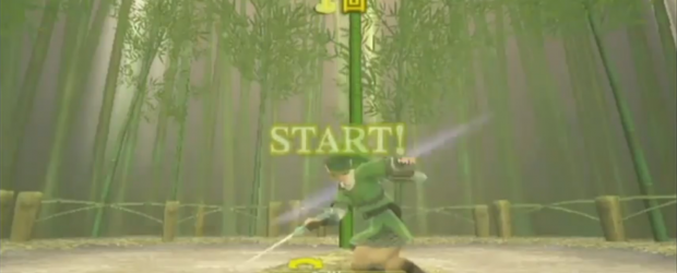
I’m not sure how we ended up with the current concept, but we were heavily inspired by the cutting game featured in Legend of Zelda: Skyward Sword.
LOZSS is a beautiful game – there’s no denying it. The algorithm used to created the “painterly” effect is actually pretty cool and is more than just have pretty textures wrapped onto 3D objects. LOZSS does some fancy distance rendering stuff, and it more or less “paints” things that are far away. Not only that, but the “brush strokes” of rendered objects stay at a consistent size, so the game feels more two-dimensional like a painting. That’s probably a little confusing, but it makes sense why that technique creates such an interesting effect.
Even though we couldn’t use quite the same rendering effect on our iPhone game, we could create similar looking textures. I started off by creating textures from photographs, but we quickly saw that that wouldn’t create the result we wanted.
So I moved from there to hand-painting the textures digitally. That produced a really cool look, but it ended up falling in line with Wind Waker’s cell shaded look. We experimented with the cell shaded look, but it just didn’t offer the level of visual complexity that our small-scale game needed.

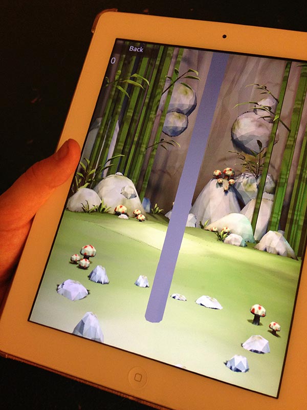
This photo gives you an idea of how the game used to look. The textures wre much flatter, and the geometry was much more complex.
Finally, I started throwing painted looking brush strokes onto my hand painted textures and got fairly close results to what I was looking for. LOZSS almost has a pointillist look to it, and I was having a hard time achieving that digitally. What was about to happen absolutely blew my mind. James started messing around in Photoshop with my textures and he stumbled on a filter called “watercolor.” Now, the default settings for the watercolor filter don’t look very nice at all, but after tweaking it some it gave us the pointillist look we wanted!
Of course, any self respecting designer wouldn’t use filters, but hey, whatever tool gets the job done I say.
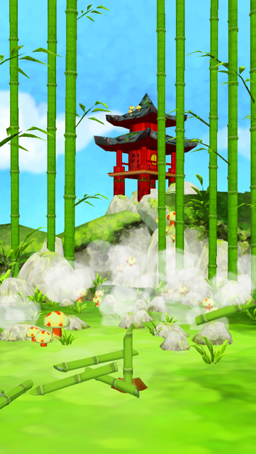
Another big change that happened during the course of development was the world the game took place in. As you can see in the screenshot above, the original world was up against a stone cliff. We got less than favorable feedback on this setup (mainly because it was so loosely executed), so we decided to change it to an open world and add things like a pagoda to make it feel more open and lively. This also allowed us to animate the bamboo poles in the background and create a rotating skybox just to add the little bit of extra polish on top. This is how the game currently looks:
With each project we work on, I continue to see just how important iteration is to the art process. Without feedback from friends and a willingness to make changes, our projects can’t become fully realized. We must always push ourselves to go one step further even when we think we can’t.


